
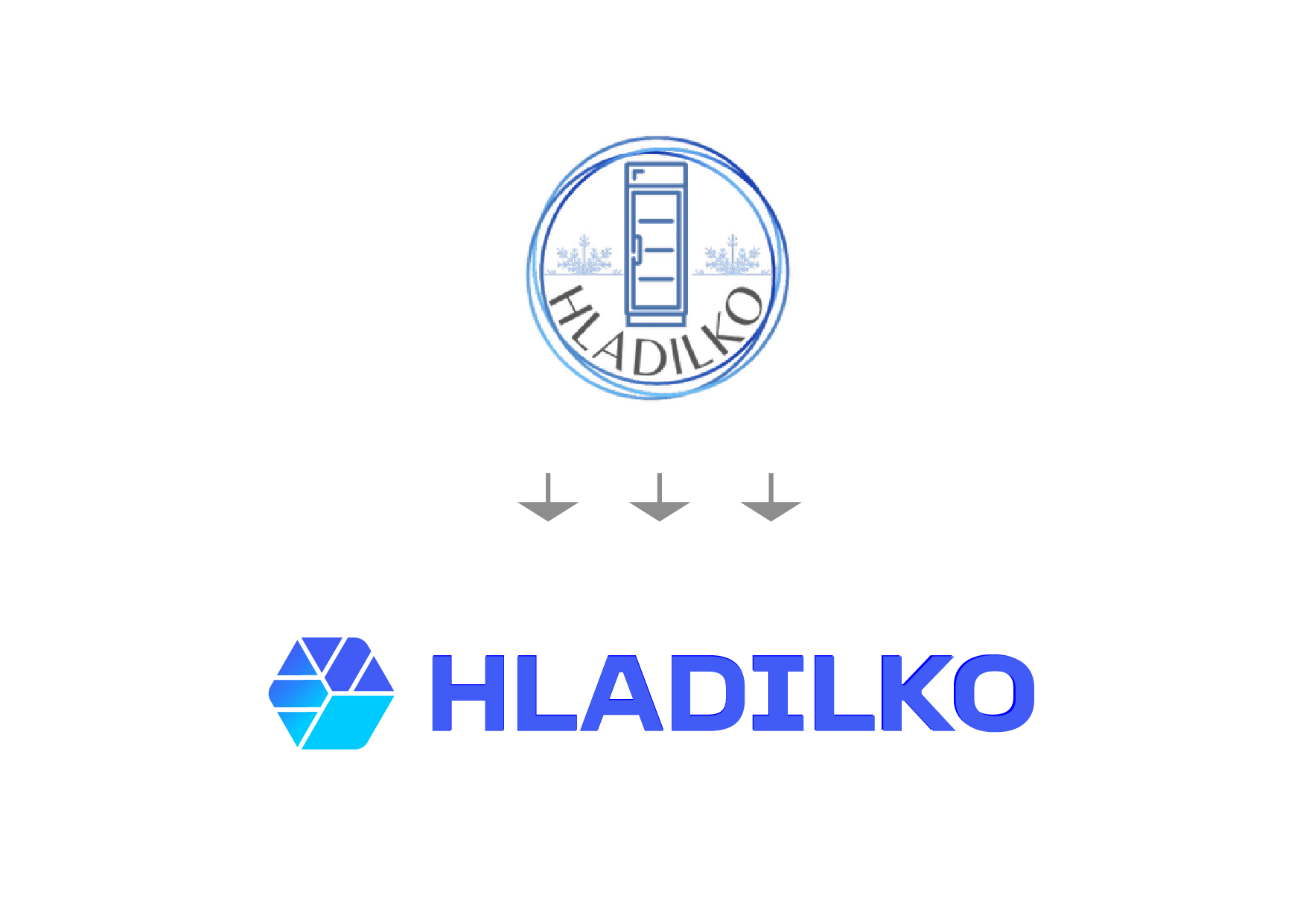

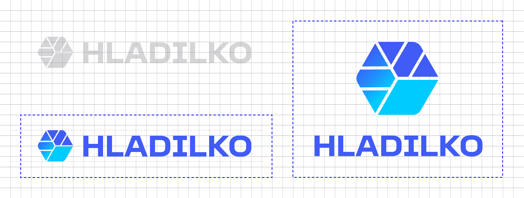
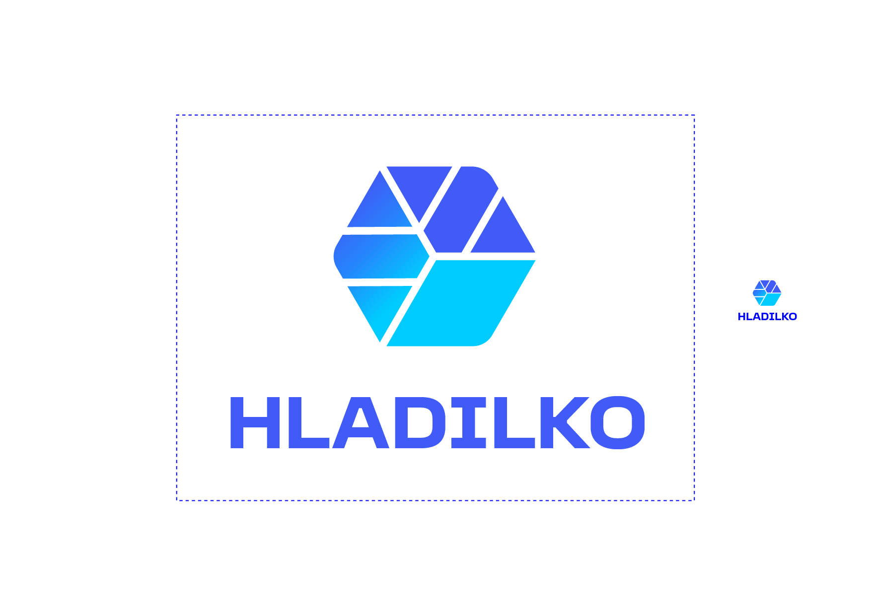
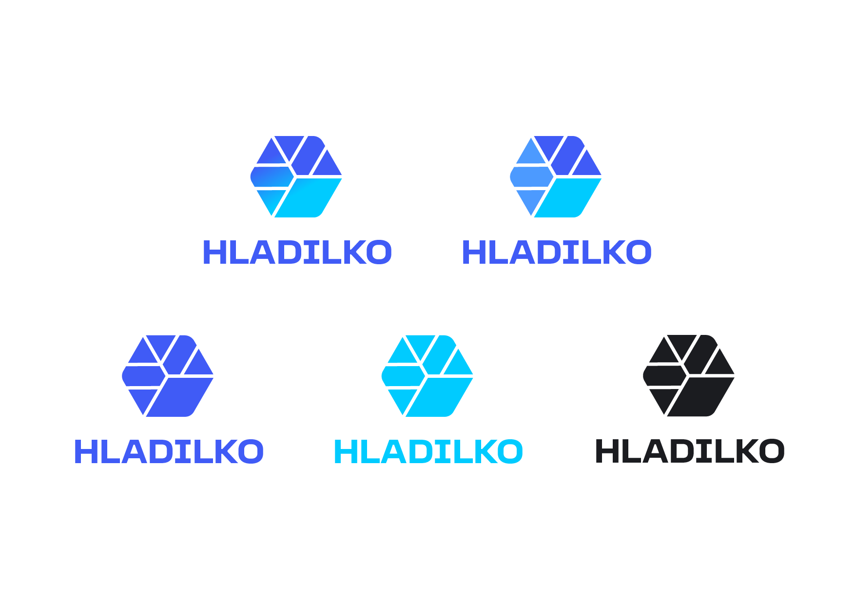
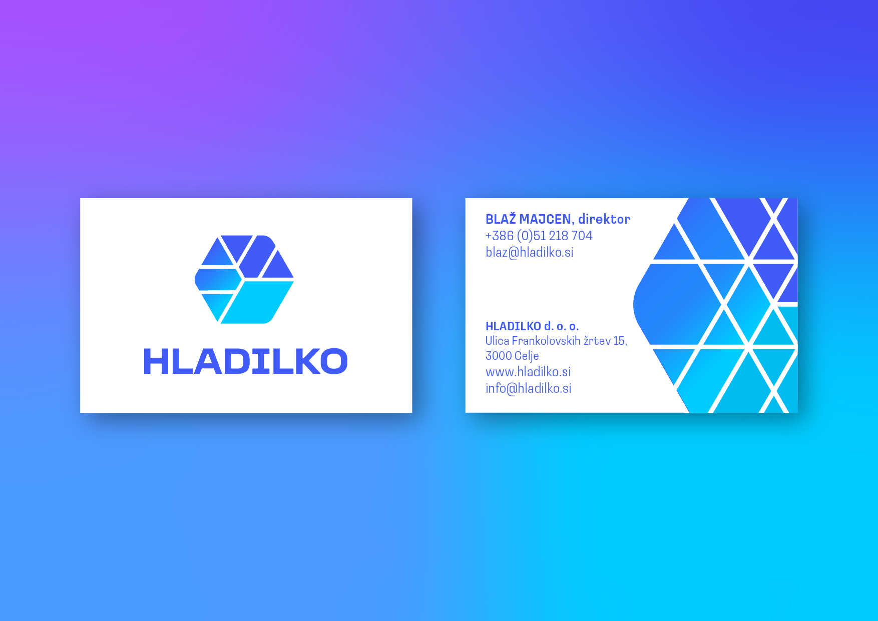
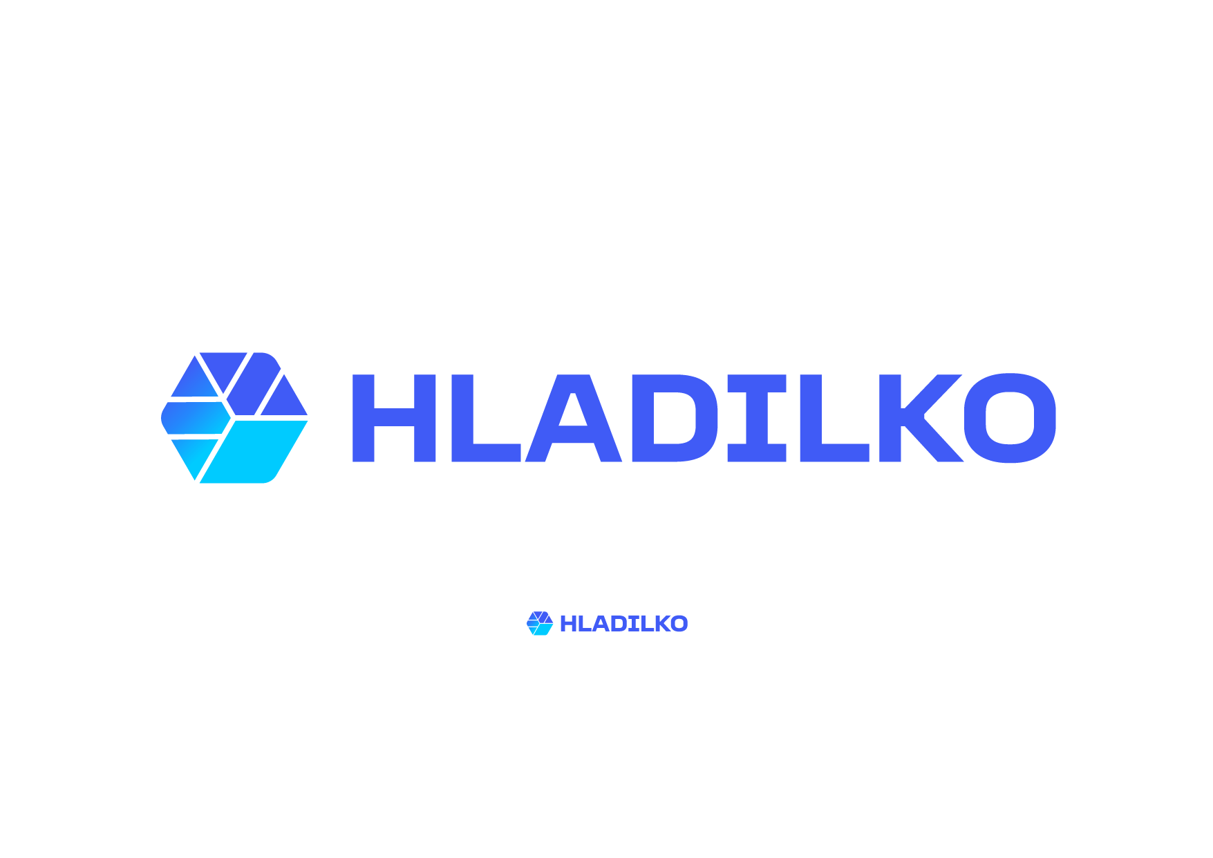
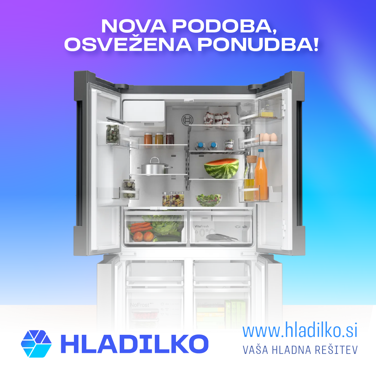
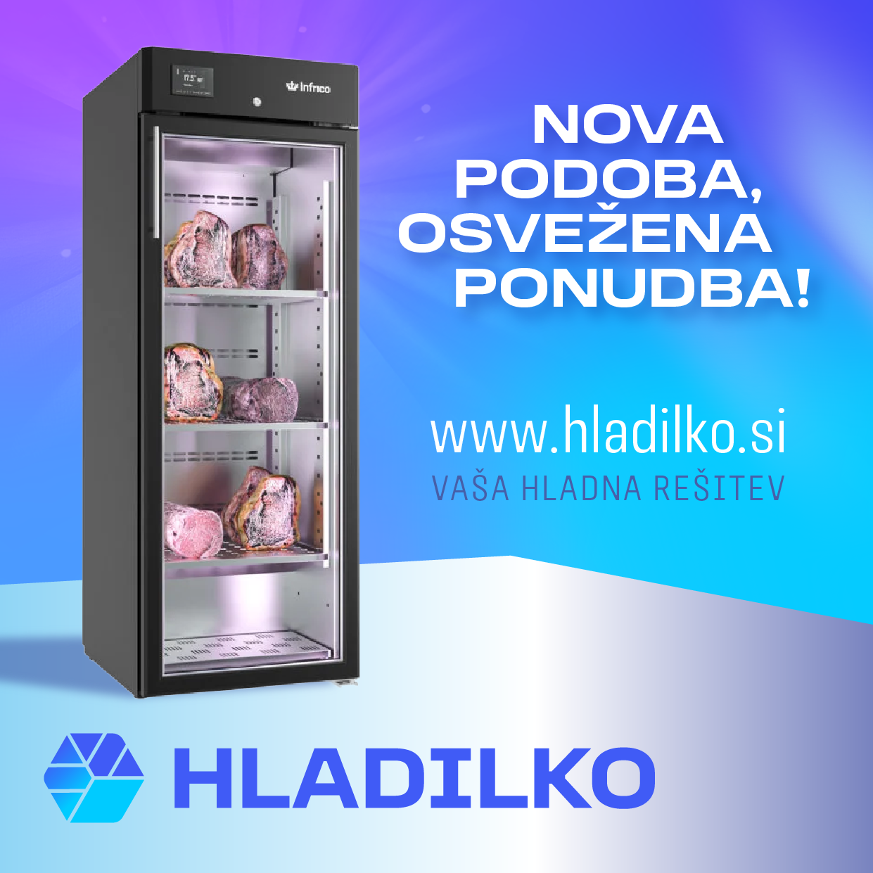
This project features a comprehensive corporate identity redesign for Hladilko, a company specializing in the sales, installation, and maintenance of professional and domestic cooling equipment—ranging from refrigerators and freezers by leading manufacturers to advanced air conditioning systems. The new logo represents a major evolutionary leap forward from the legacy mark, which was visually overcomplicated and functioned more as an illustration than a functional logo.
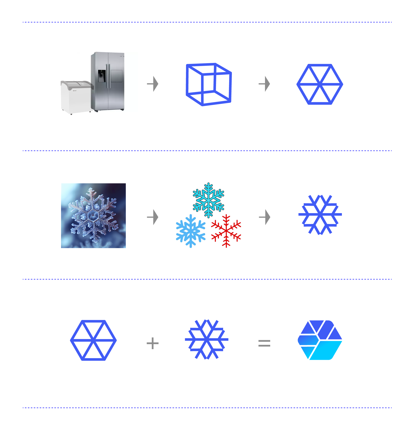
The visual concept of the new emblem is derived from a calculated synergy between two core symbols:
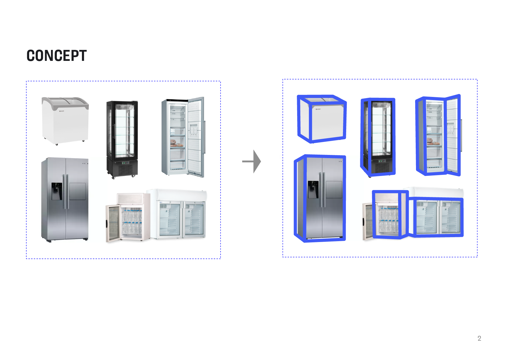
The Cuboid/(Ice) Cube: Since refrigeration appliances and units are geometrically defined by their block-like structures, this form was reduced to a minimalist symbol of a cube shown in axonometric perspective. The three-dimensional illusion of spatiality directly mirrors the physical volume and nature of the client's products.
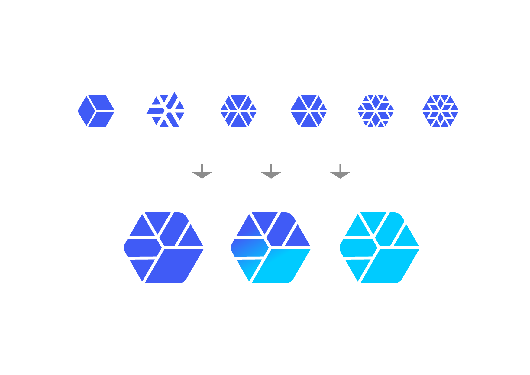
The Snowflake Geometry: The essential element of cooling and freezing is captured through a stylized snowflake. Its natural hexagonal blueprint aligns mathematically with the projection of the cube, allowing the snowflake motif to be subtly and elegantly mapped onto the cube's facets.
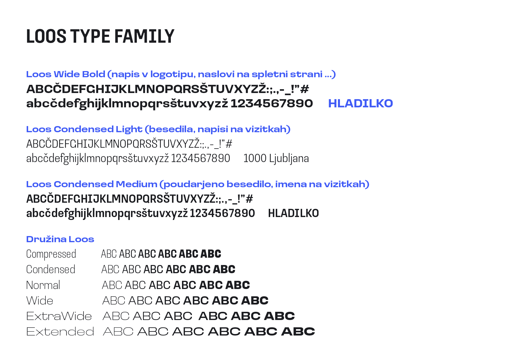
Typography plays an equally crucial role in the identity, showcasing a unique marriage of technical precision and distinct visual character. The recognizable, sharp, yet characterful letterforms reinforce the company's pillars of reliability and expertise. Through this strategic visual overhaul, we successfully elevated the Hladilko brand, instilling a modern technological aesthetic that prepares the company for next-level business and market challenges.