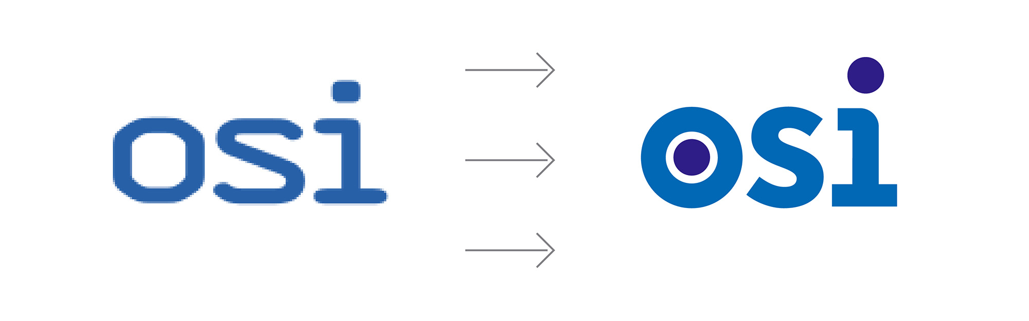
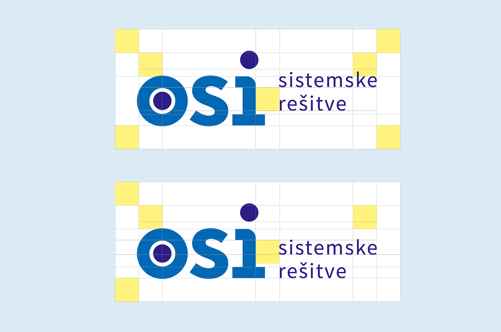
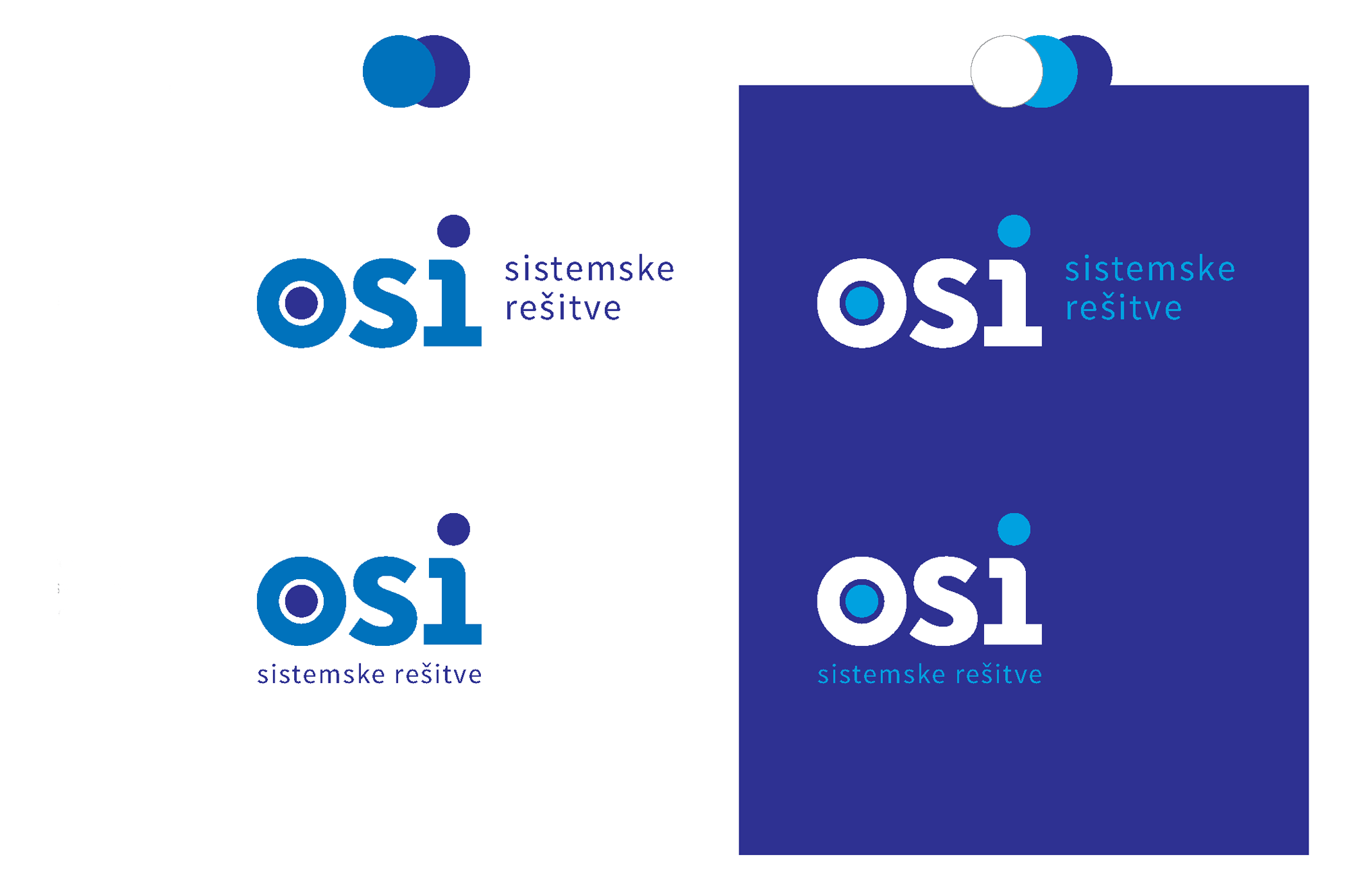
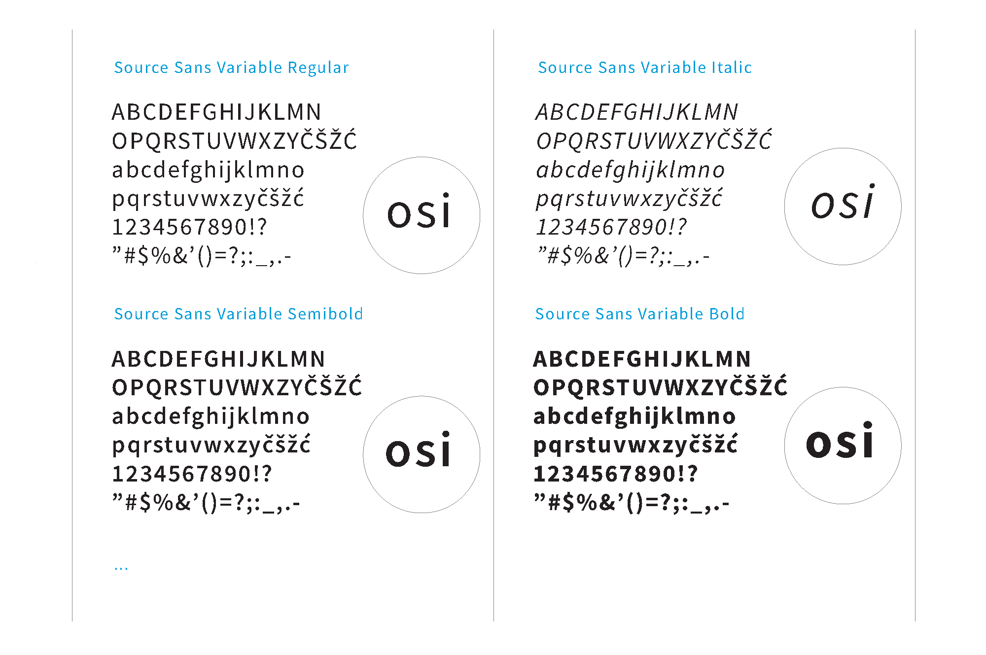
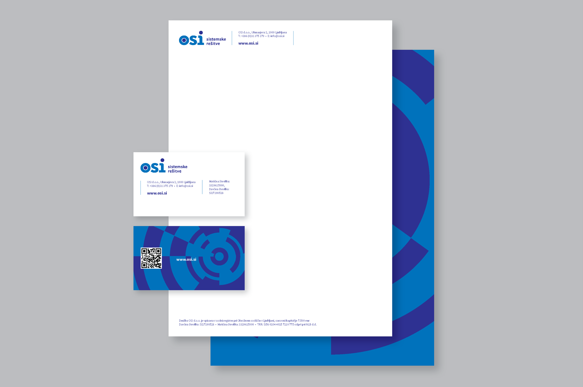





The visual identity redesign project for the IT company OSI stemmed from the need to modernize its primary symbol. Since a comprehensive visual identity is never just a logo, my goal was to develop a robust system of secondary visual elements that would imbue the brand with distinctiveness, add depth, and ensure adaptability across a wide range of contexts.
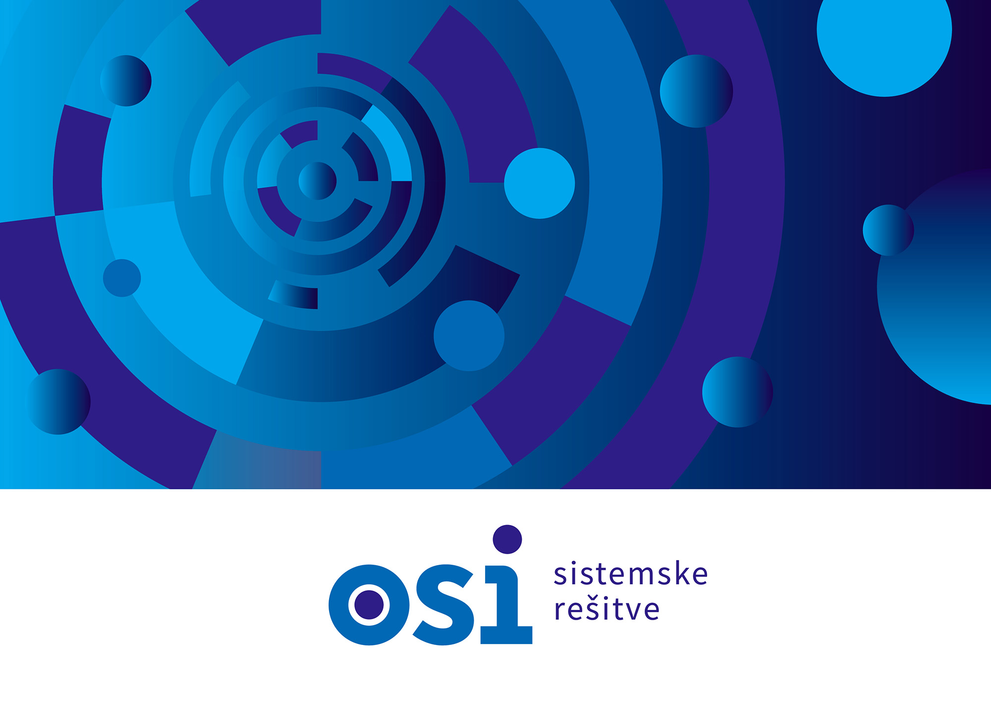
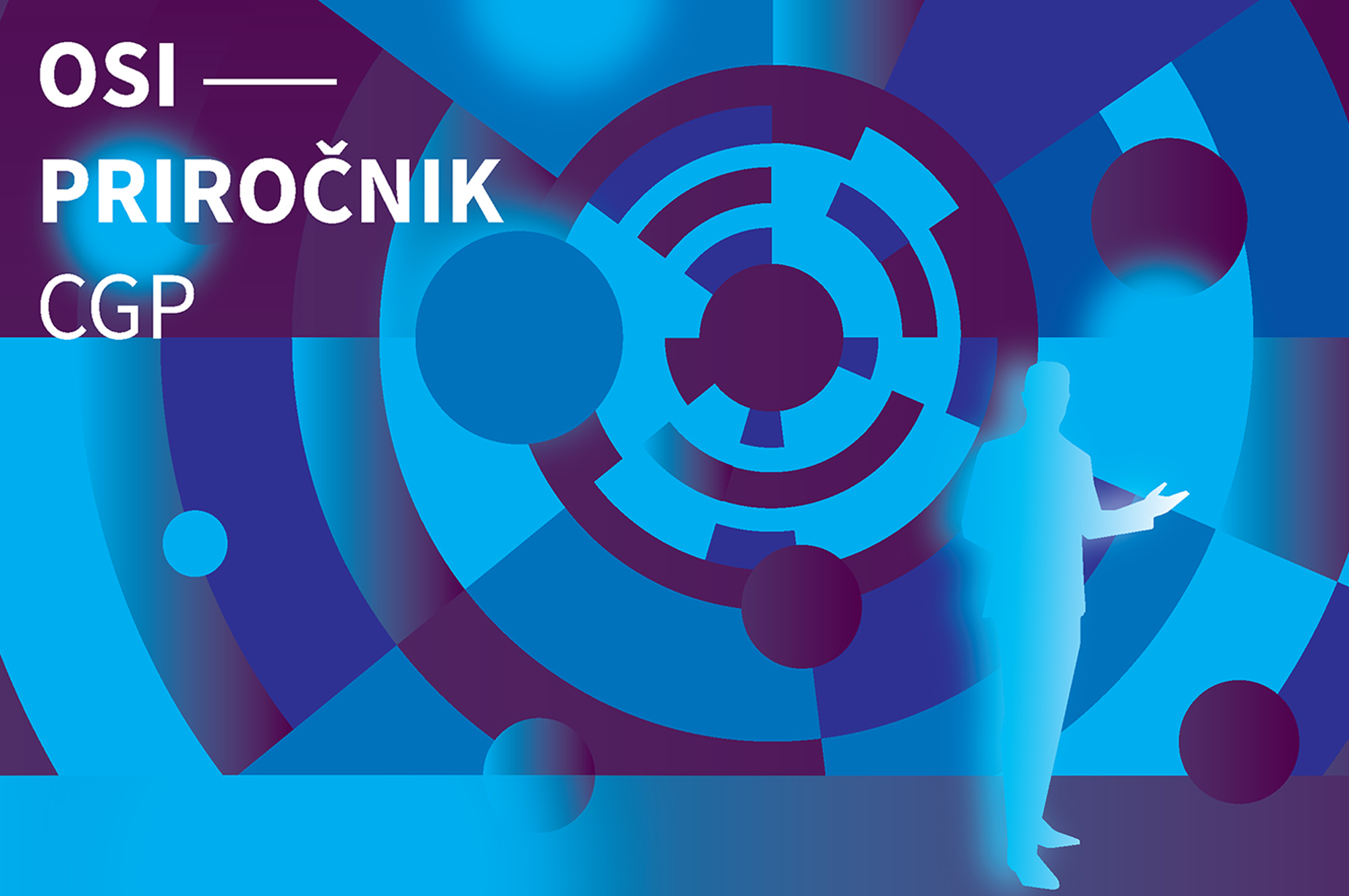
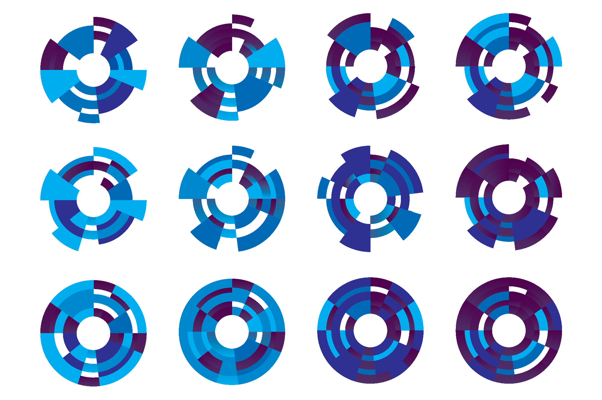
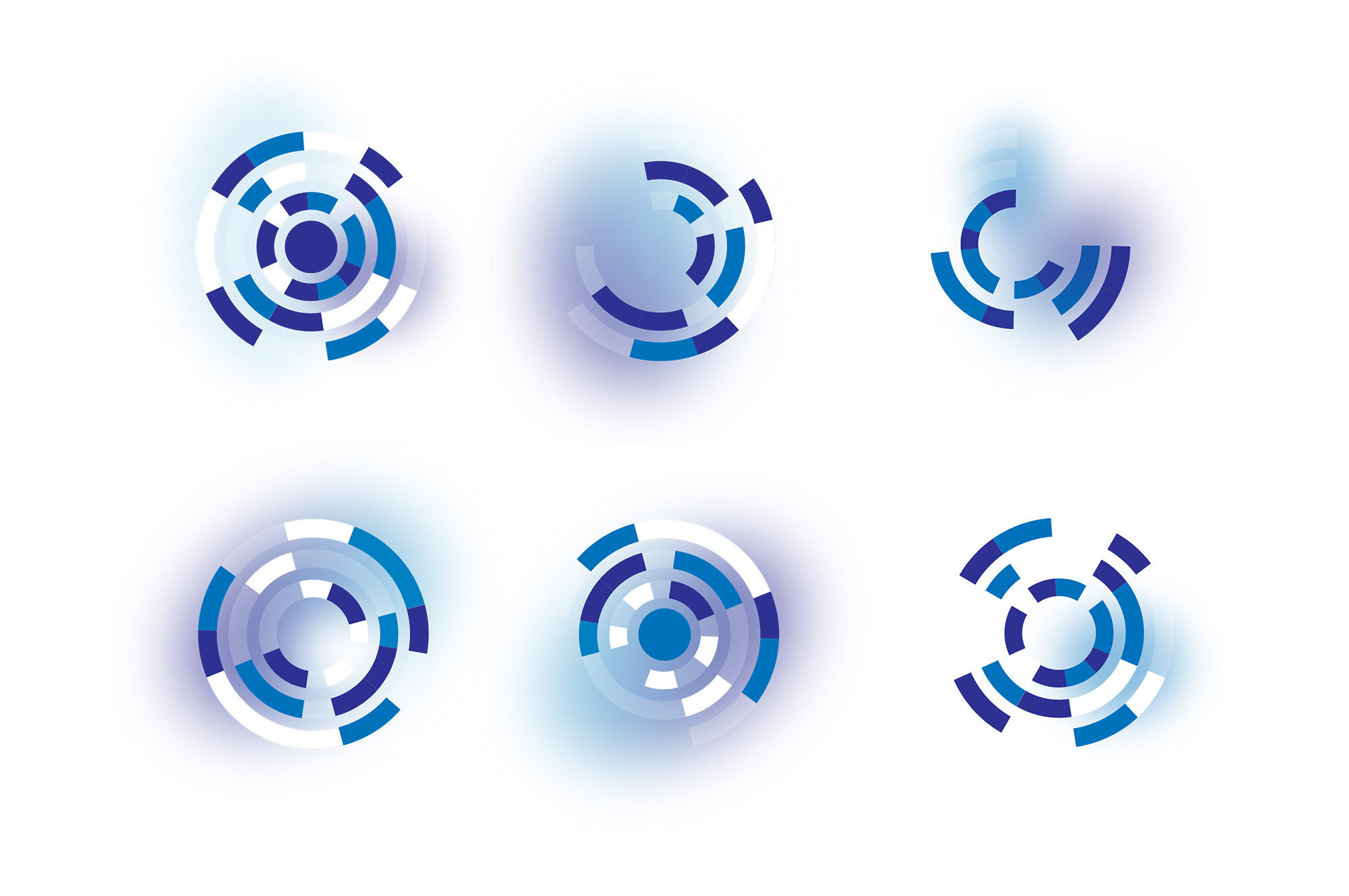
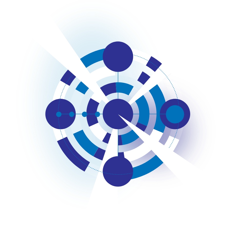
The foundation of the new identity is an updated logo, from which I systematically derived a specific visual language based on concentric circles. In the IT sector, these serve as a powerful visual metaphor for data dissemination, system integration, and technical precision. I incorporated this geometric motif as a unifying thread into a series of unique custom illustrations created for their new website—which I also designed from scratch. These abstract, contemporary visuals make OSI’s technologically complex solutions more accessible to the user through a clean, aesthetic approach, while simultaneously creating a consistent and cohesive user experience throughout the site.
The foundation of the new identity is an updated logo, from which I systematically derived a specific visual language based on concentric circles. In the IT sector, these serve as a powerful visual metaphor for data dissemination, system integration, and technical precision. I incorporated this geometric motif as a unifying thread into a series of unique custom illustrations created for their new website—which I also designed from scratch. These abstract, contemporary visuals make OSI’s technologically complex solutions more accessible to the user through a clean, aesthetic approach, while simultaneously creating a consistent and cohesive user experience throughout the site.