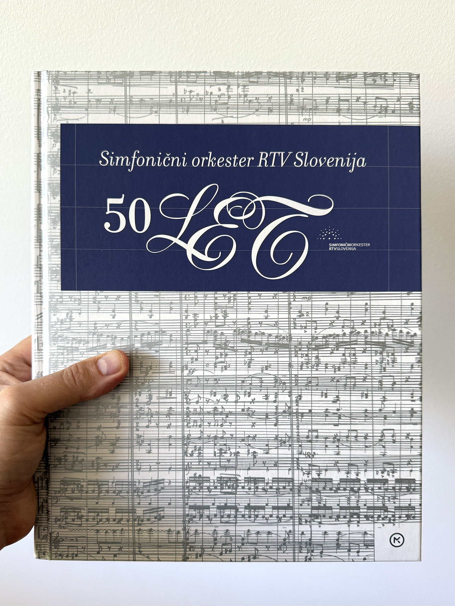
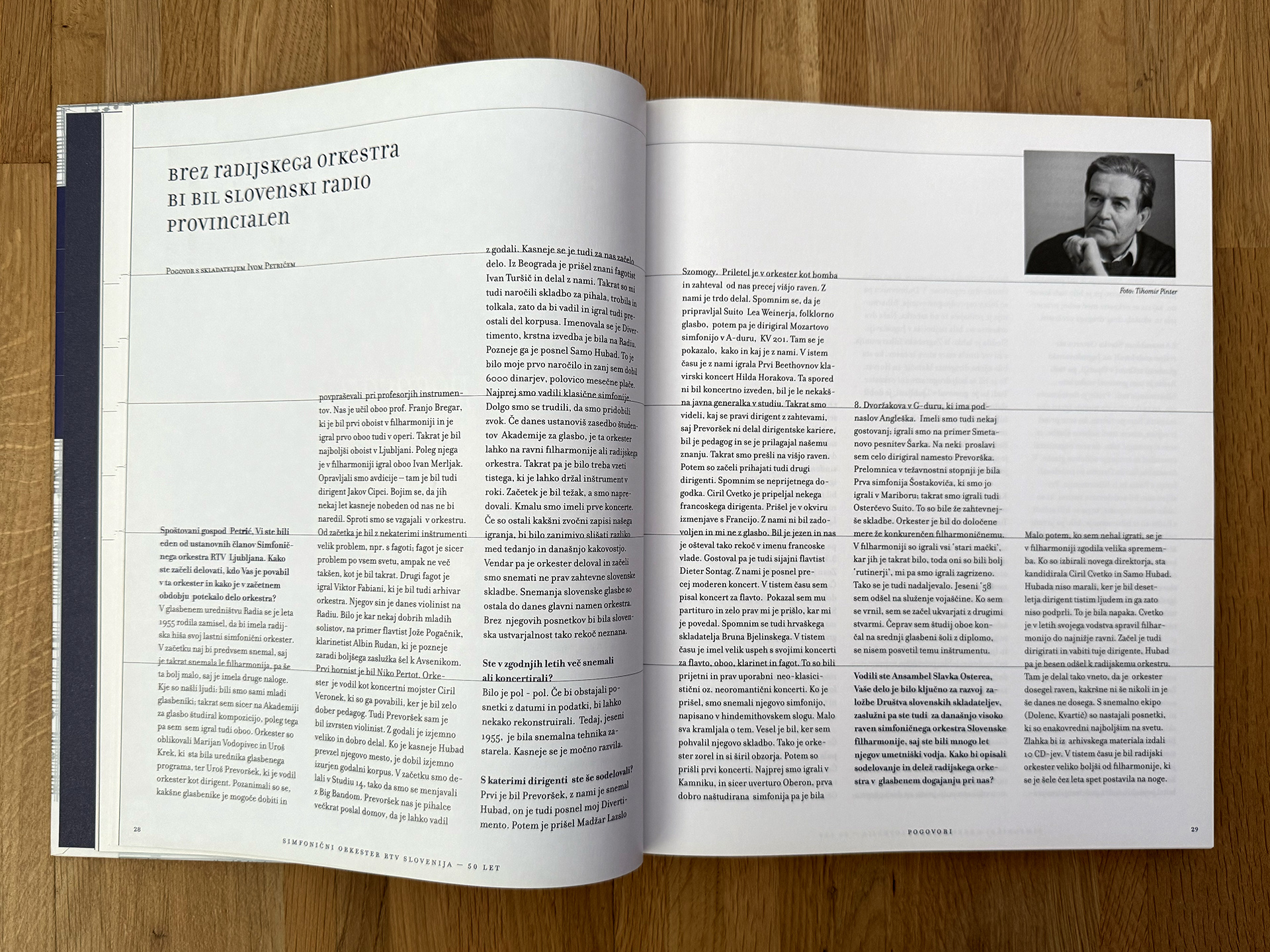
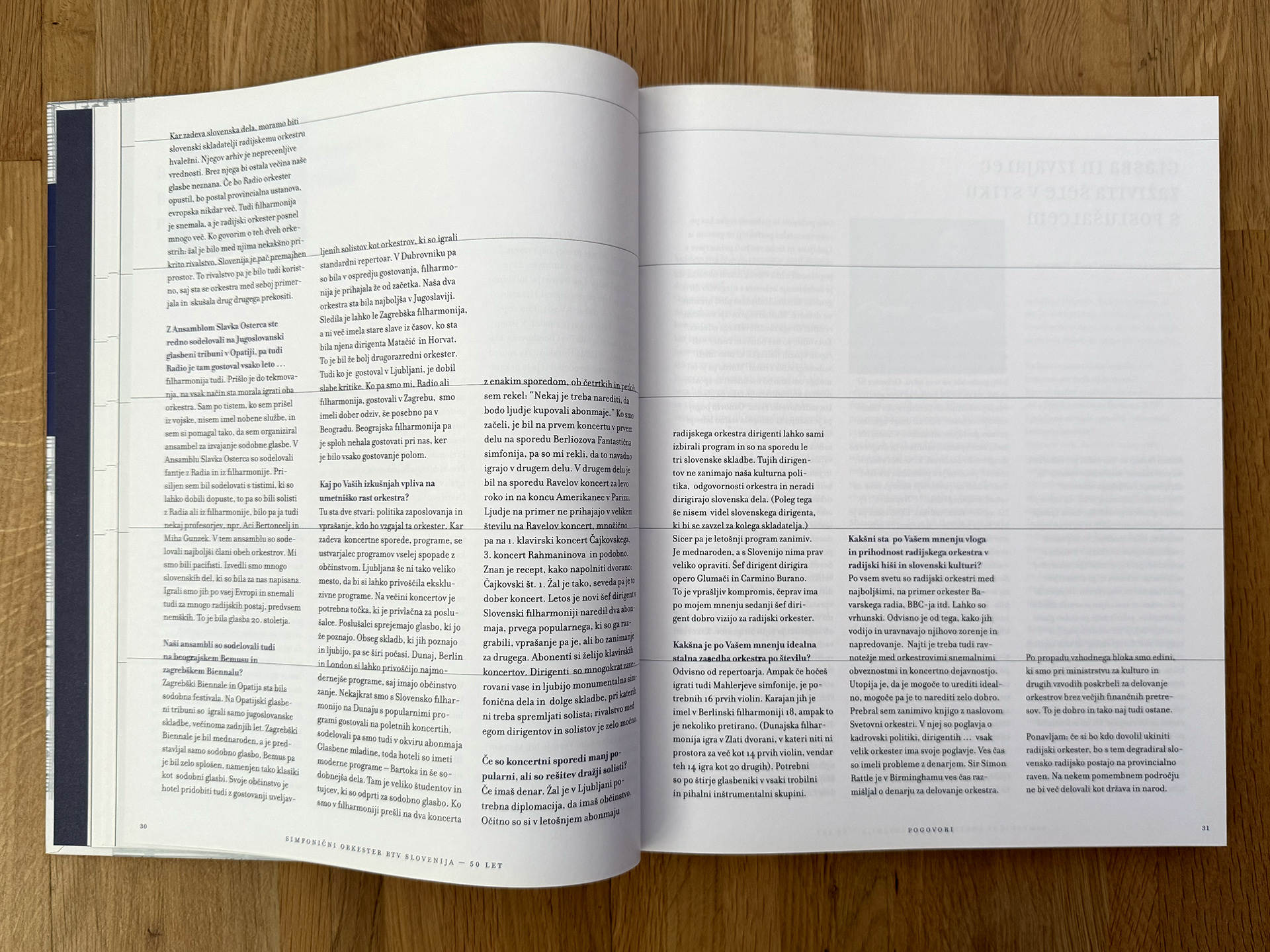
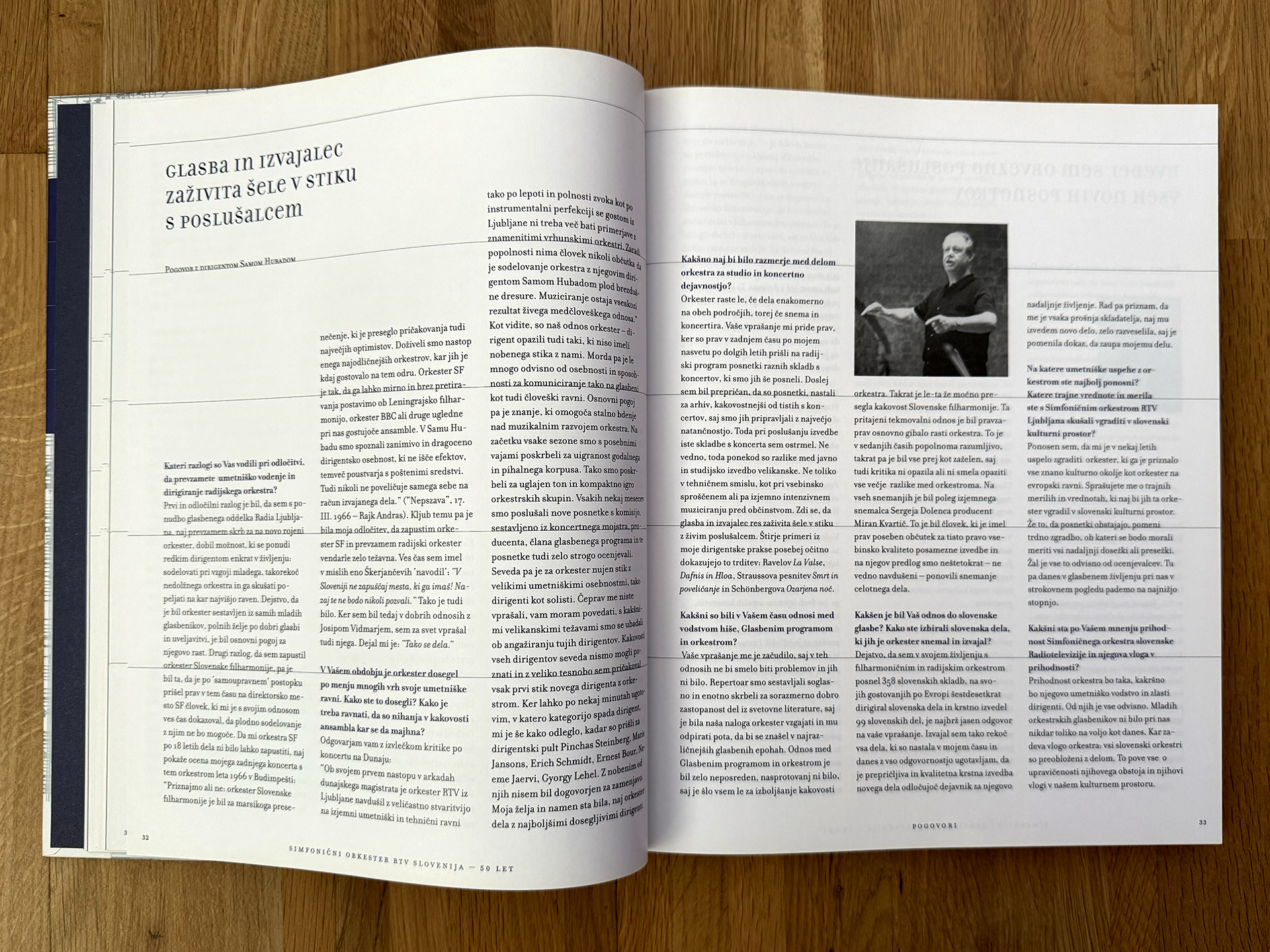
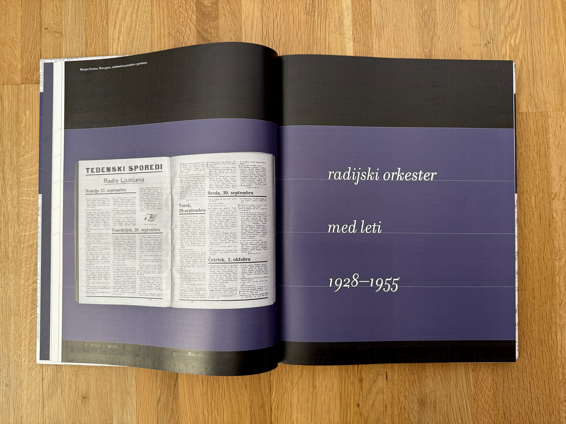
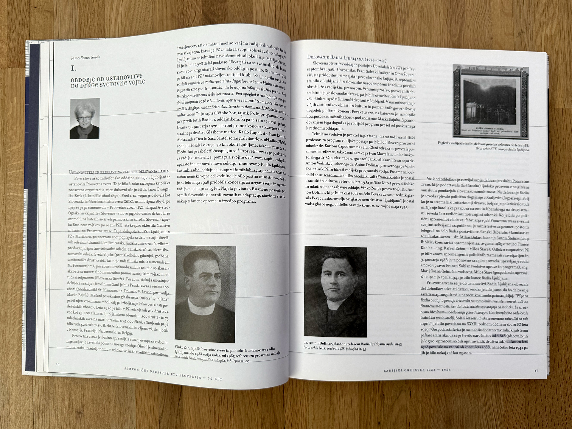
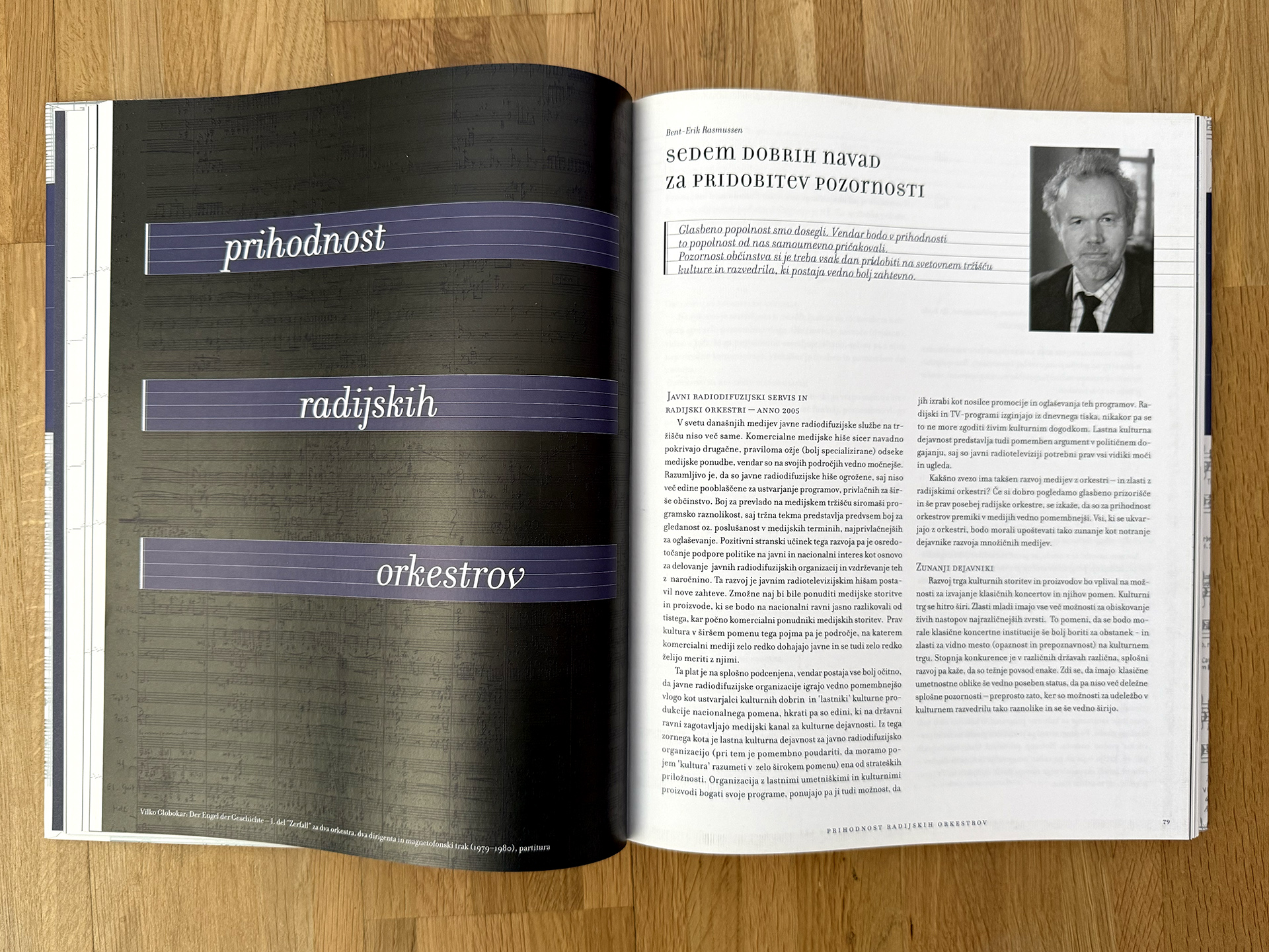
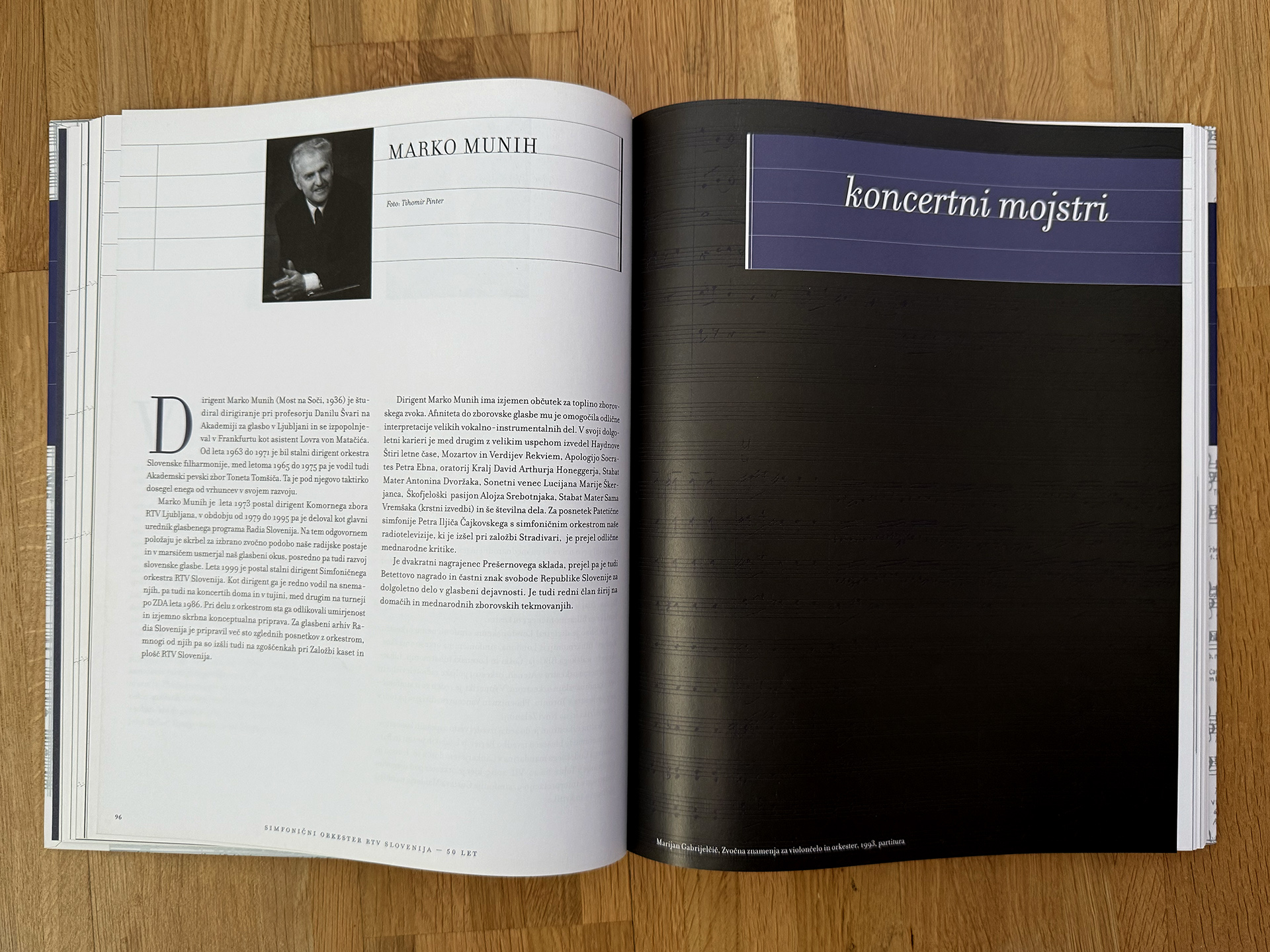
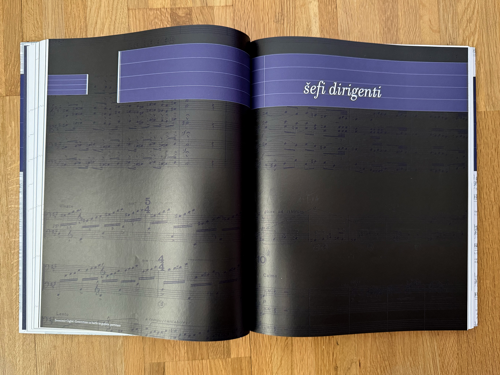
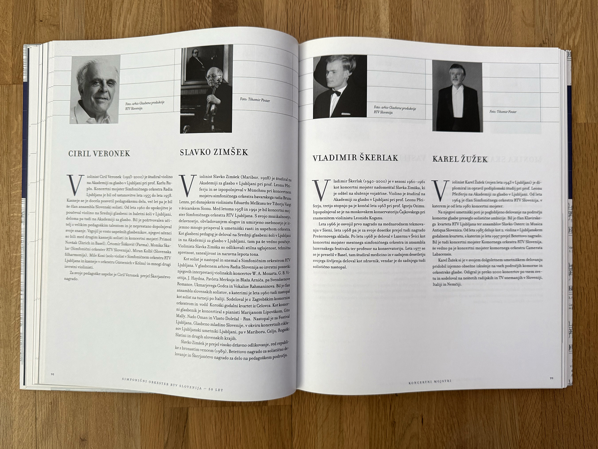
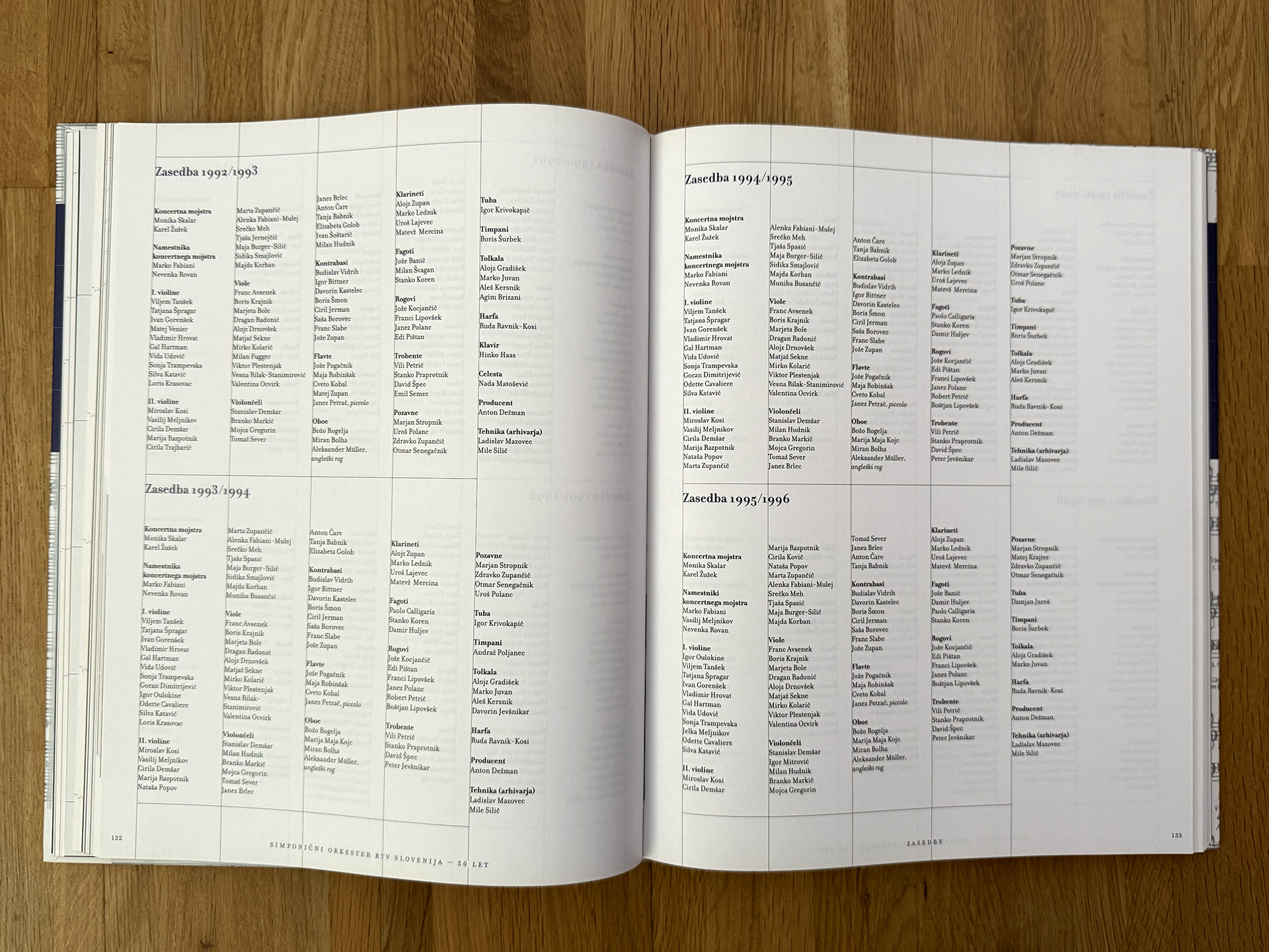
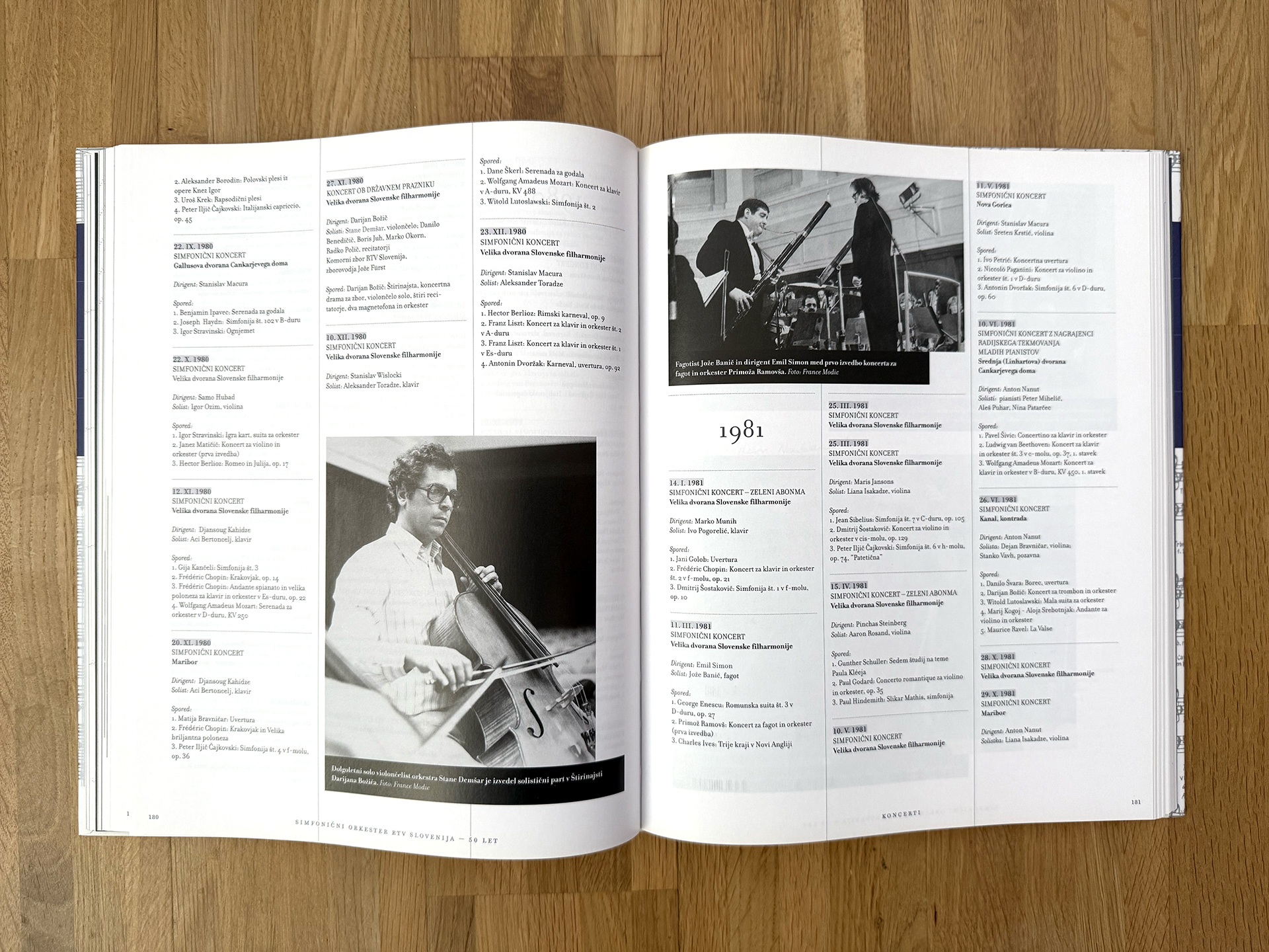
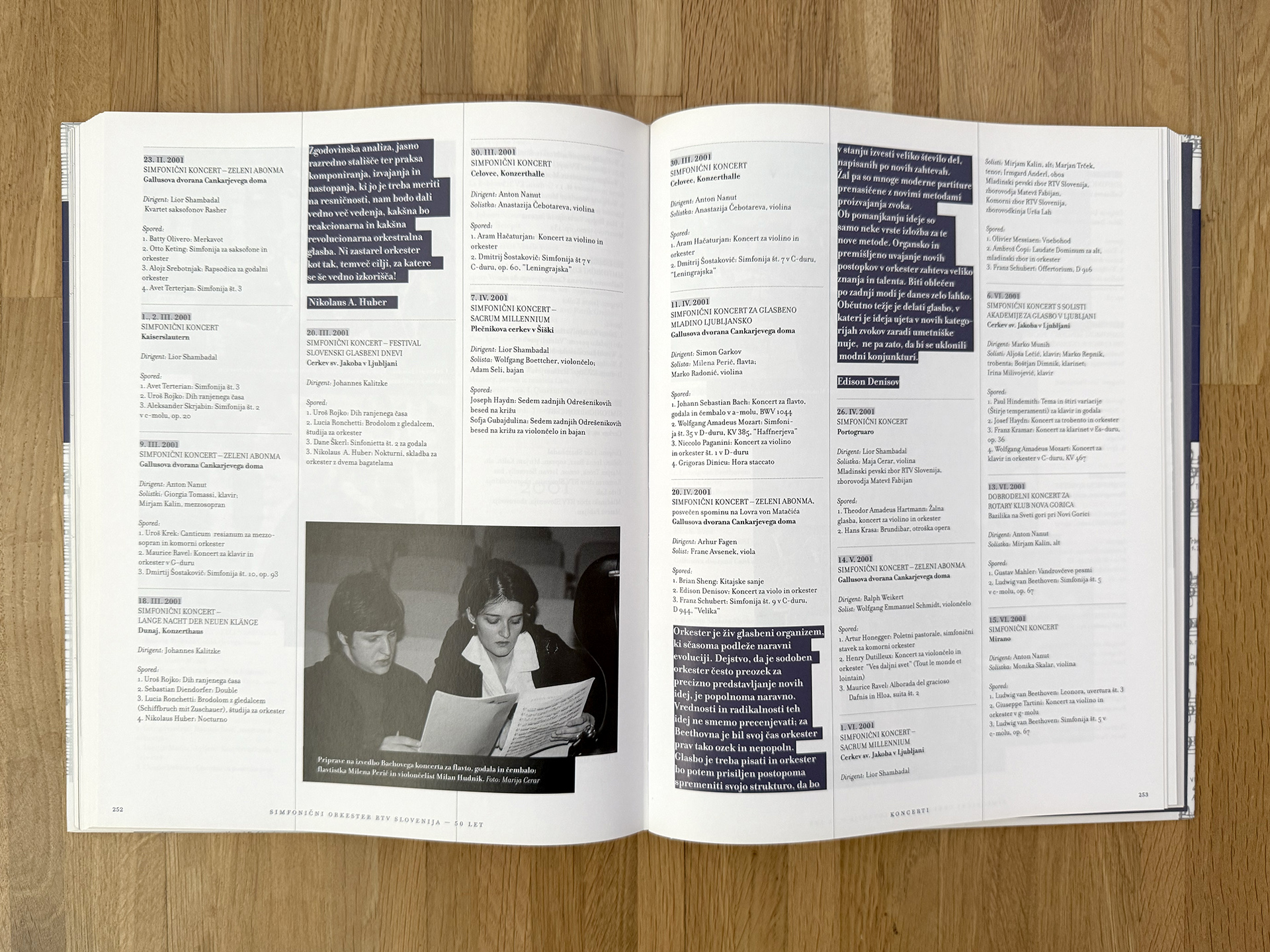
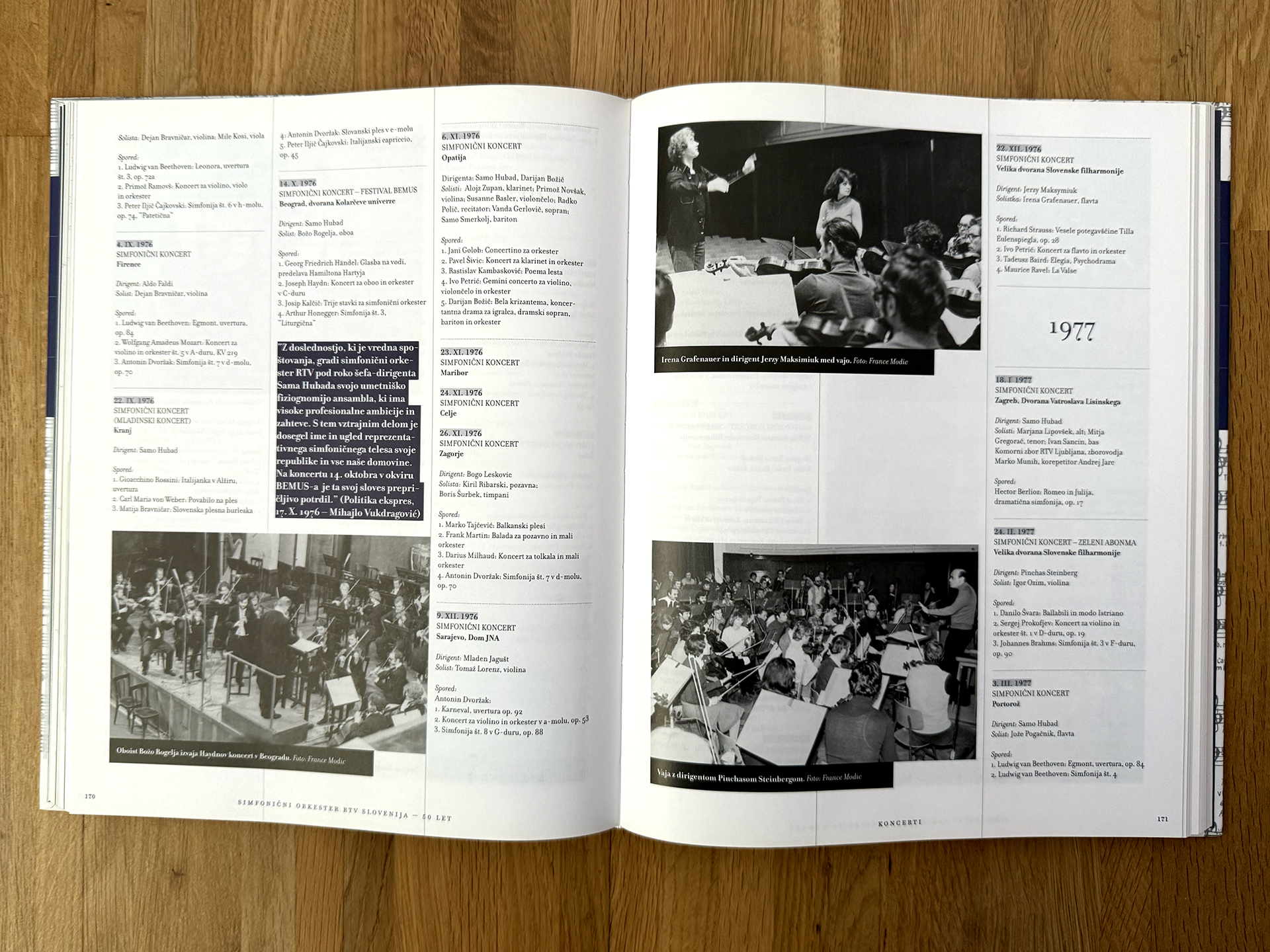
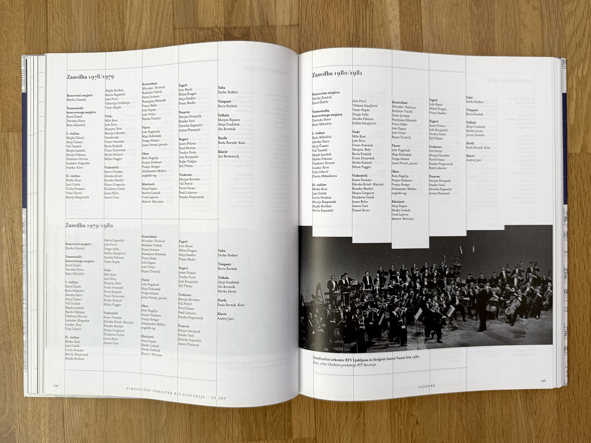
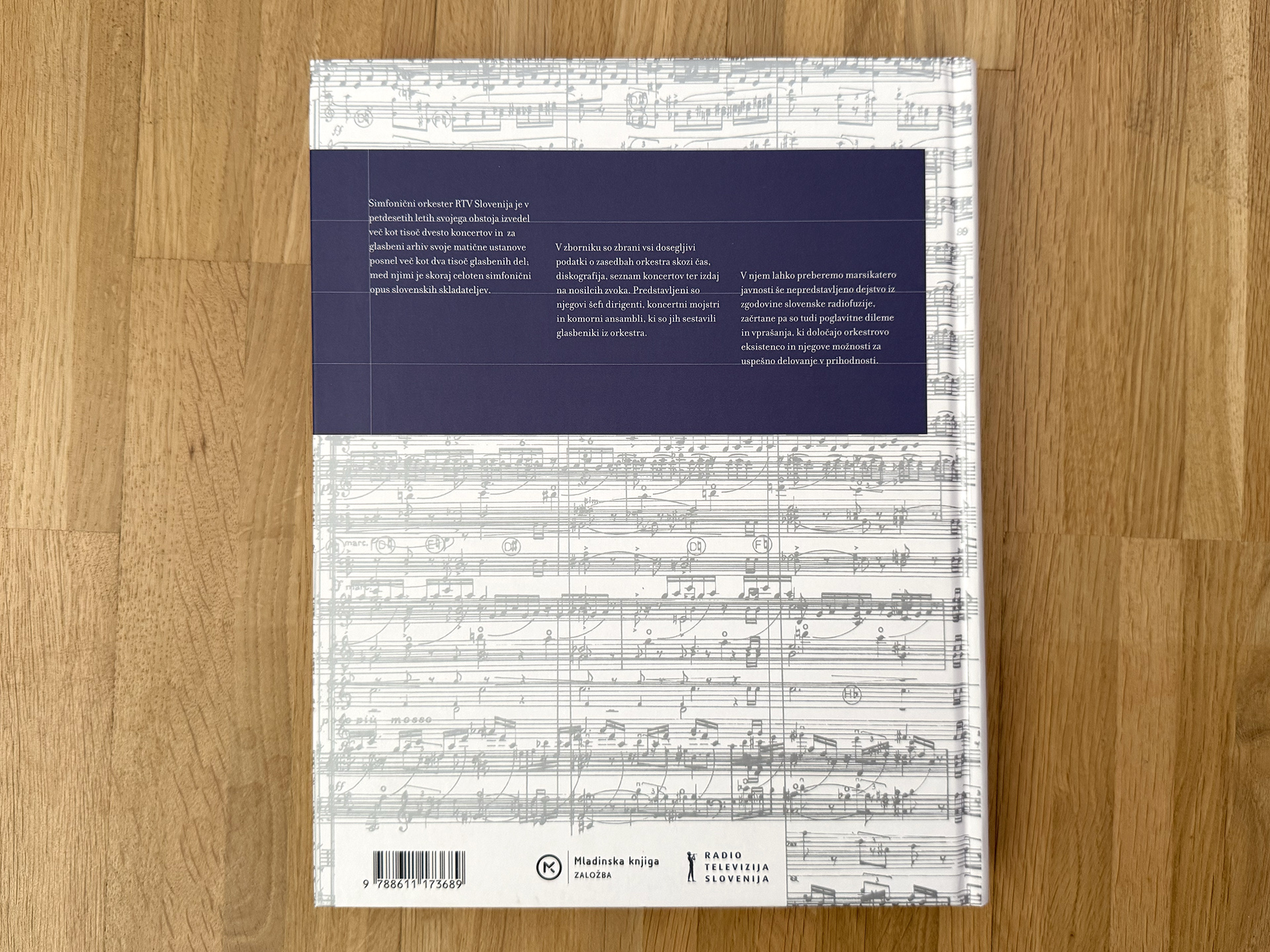
Designing the comprehensive monograph for the 50th anniversary of the RTV Slovenia Symphony Orchestra was both a great artistic challenge and an opportunity to apply the principles of "New Modernism" into design practice. New Modernism is a design trend that emerged as a direct response to the wild, deconstructive postmodernism popularized by David Carson. Instead of pure expression, New Modernism reintroduces order, clarity, and structure, but moves beyond dry formalism. Its main principle is the idea that the design grid itself is part of the content—"Grid is the message."
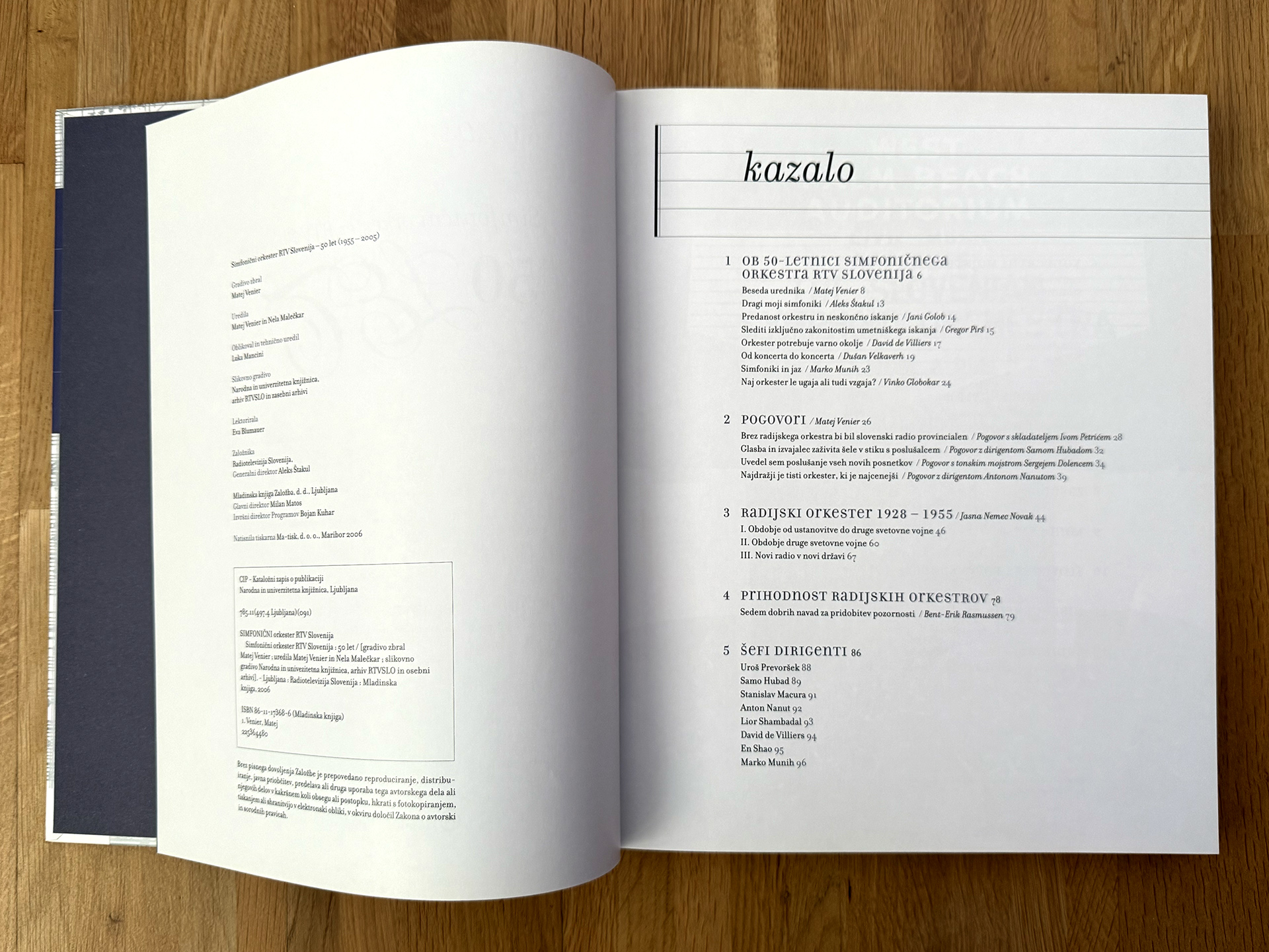
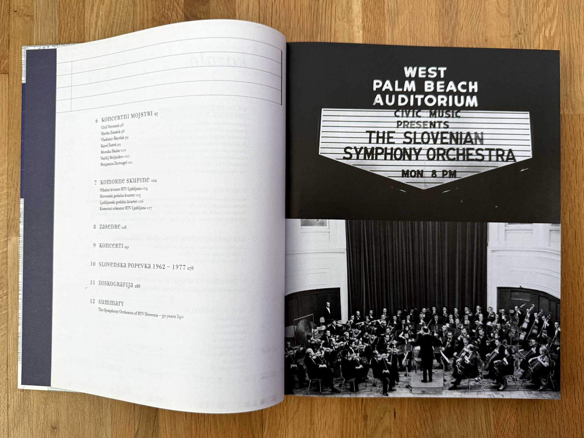
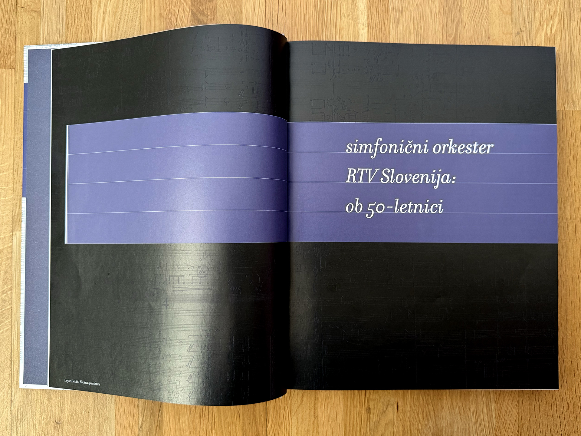
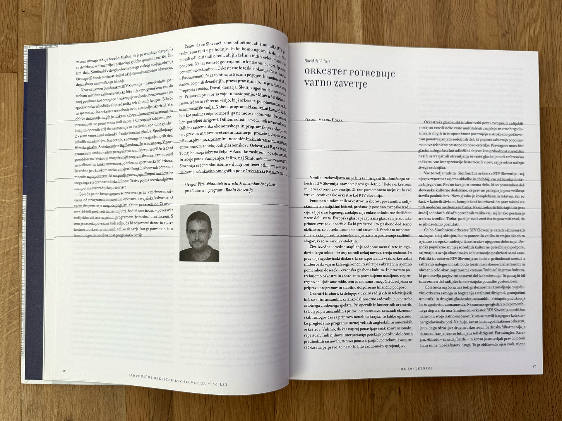
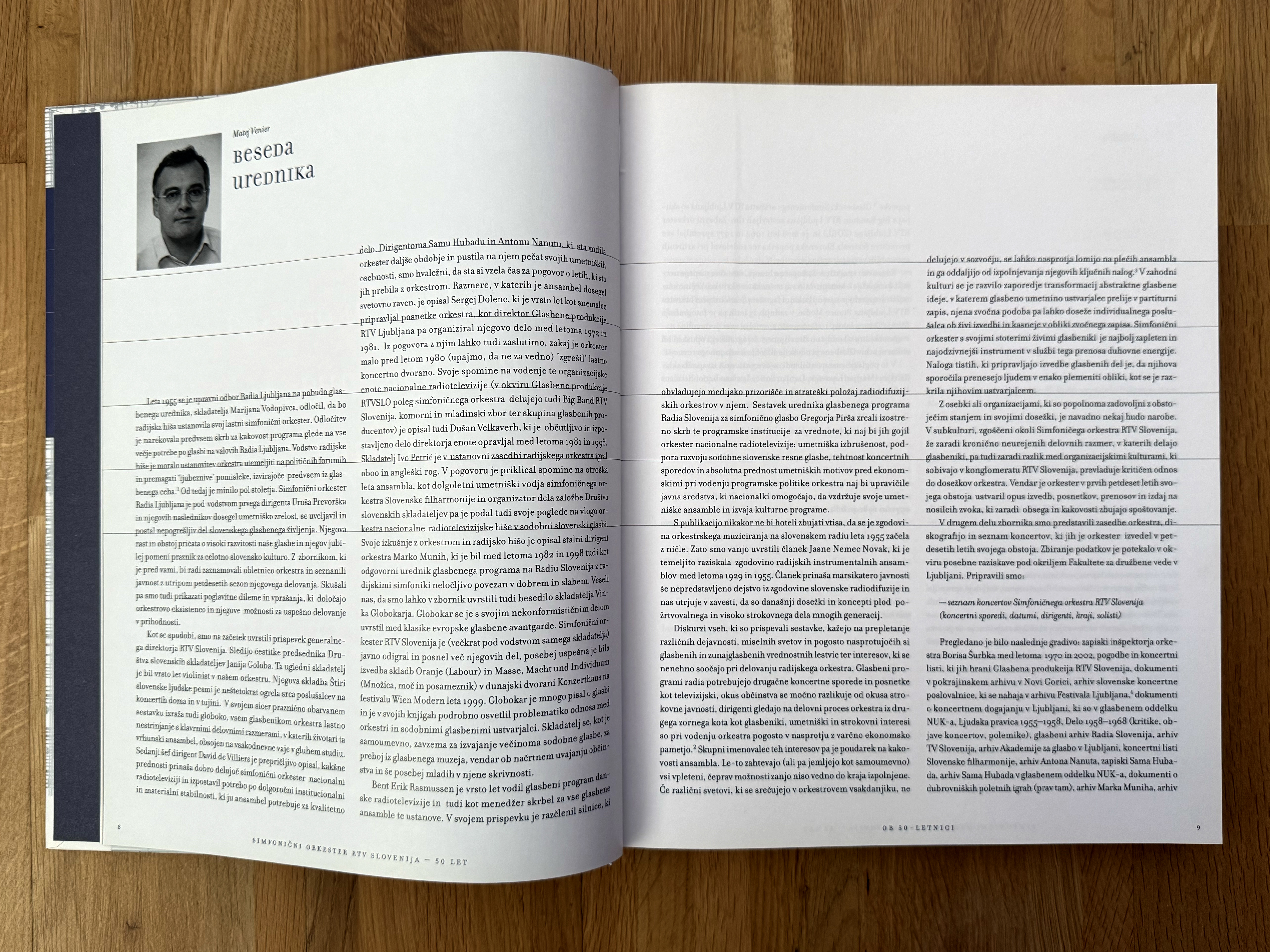
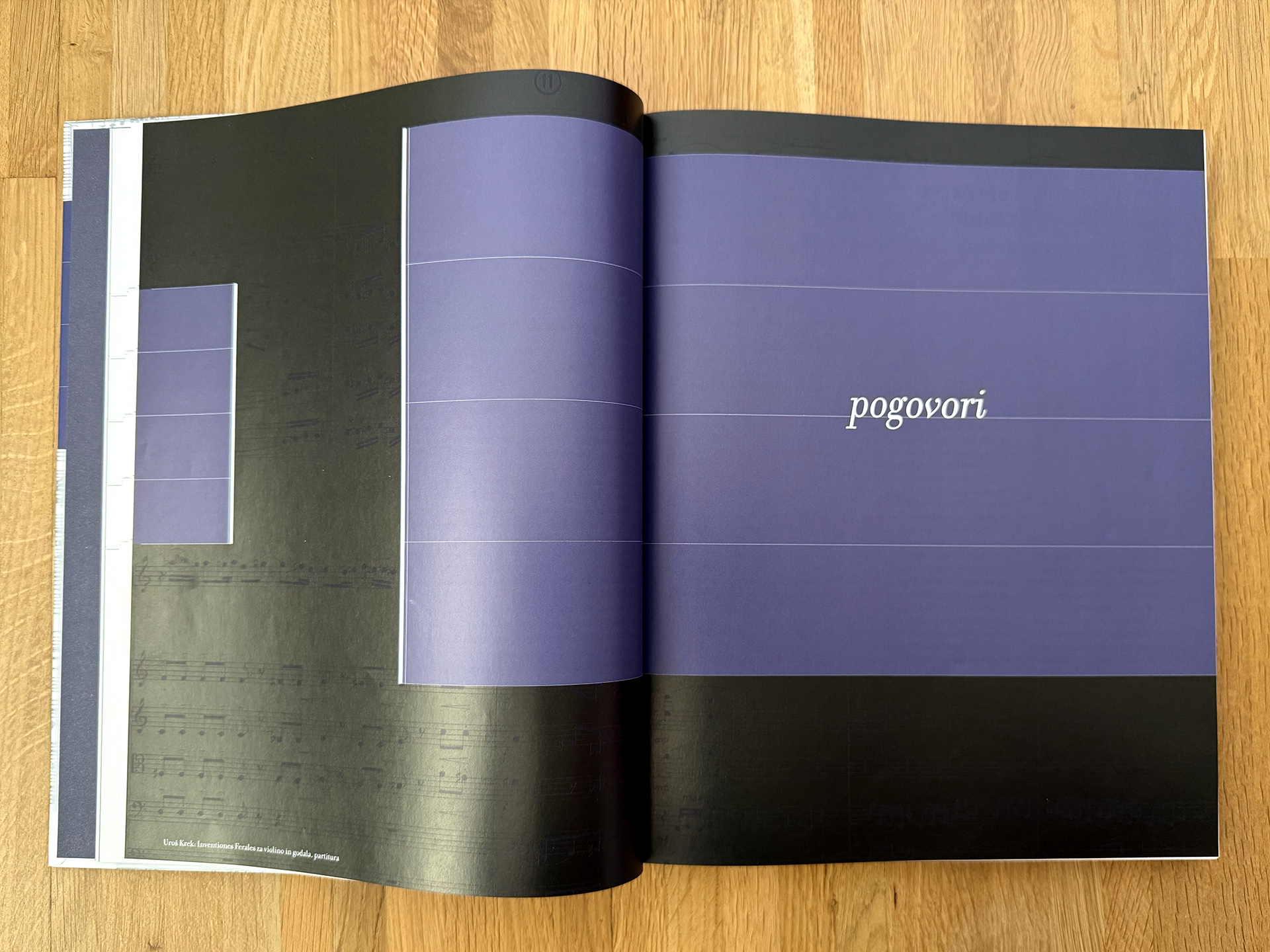
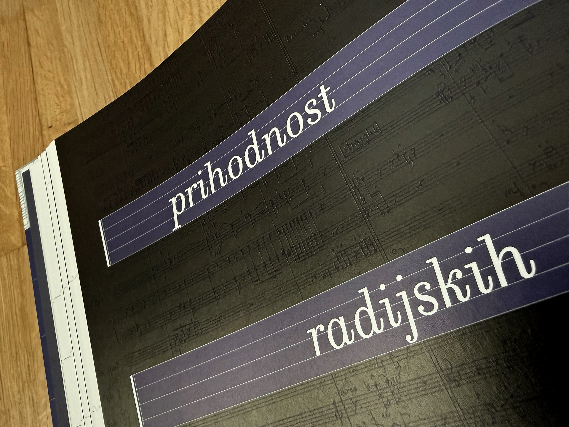
The conceptual layout of the monograph comes directly from the nature of symphonic music. The entire layout grid of the book is built on a musical staff. Throughout the book, I mathematically scaled and moved this system of five parallel lines, creating a unique composition grid for each individual chapter. All design elements—paragraphs of text, headings, and images—are placed on these lines, falling onto them just like notes on a staff. The result is a dynamic visual symphony where the rhythm of white spaces and graphic blocks creates a feeling of flowing music. Unlike traditional practice, the grid lines here are intentionally visible, which further highlights the structural rhythm of the entire book.
The typographic choice follows this concept perfectly. The main typeface used is the NeoDidone font Sofia, which features clean contrasts and elegant, distinct teardrop terminals. These details within the text do not only look sophisticated, but also visually resemble individual musical notes, completing the overall metaphor of the book as a written orchestral piece.
The conceptual layout of the monograph comes directly from the nature of symphonic music. The entire layout grid of the book is built on a musical staff. Throughout the book, I mathematically scaled and moved this system of five parallel lines, creating a unique composition grid for each individual chapter. All design elements—paragraphs of text, headings, and images—are placed on these lines, falling onto them just like notes on a staff. The result is a dynamic visual symphony where the rhythm of white spaces and graphic blocks creates a feeling of flowing music. Unlike traditional practice, the grid lines here are intentionally visible, which further highlights the structural rhythm of the entire book.
The typographic choice follows this concept perfectly. The main typeface used is the NeoDidone font Sofia, which features clean contrasts and elegant, distinct teardrop terminals. These details within the text do not only look sophisticated, but also visually resemble individual musical notes, completing the overall metaphor of the book as a written orchestral piece.