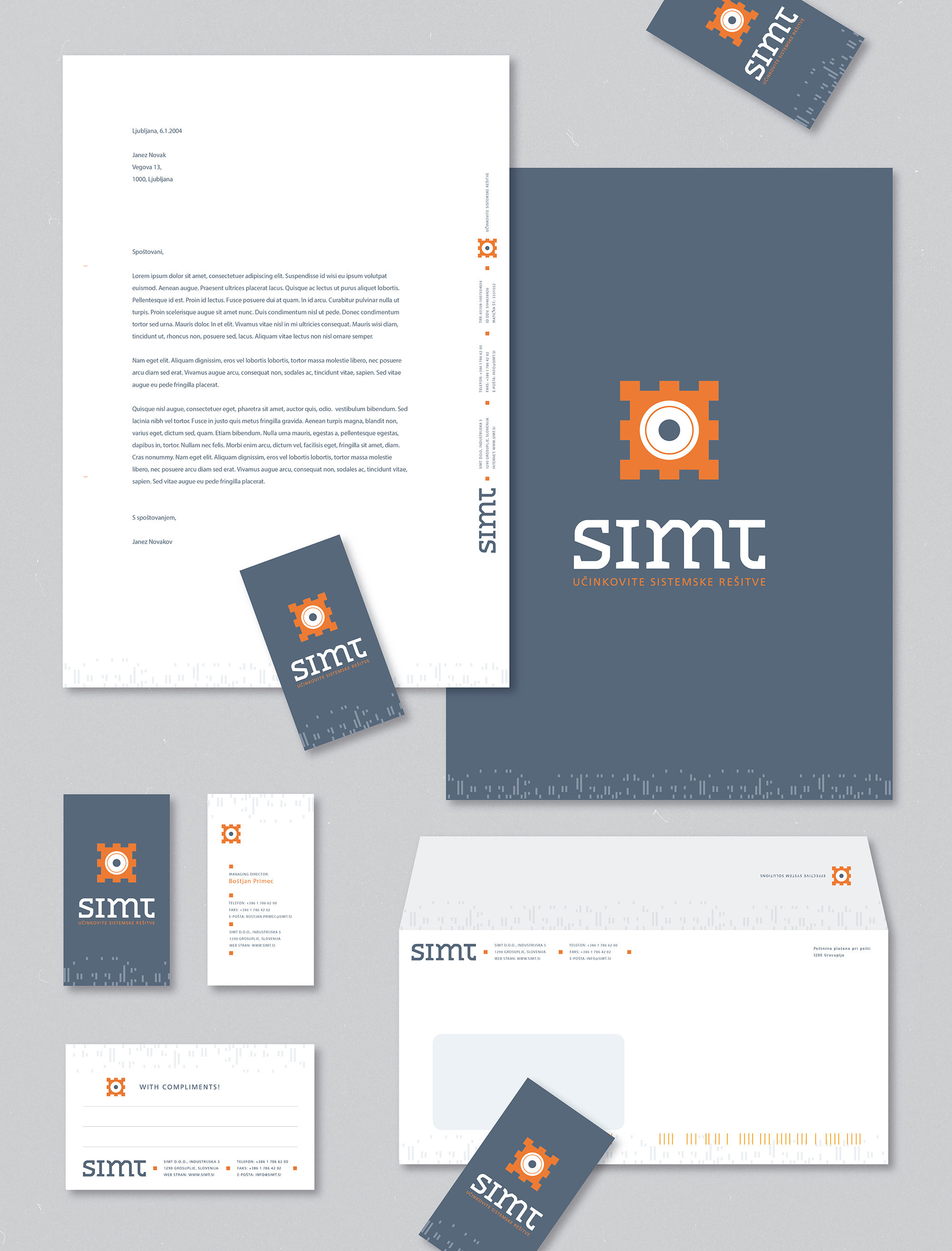
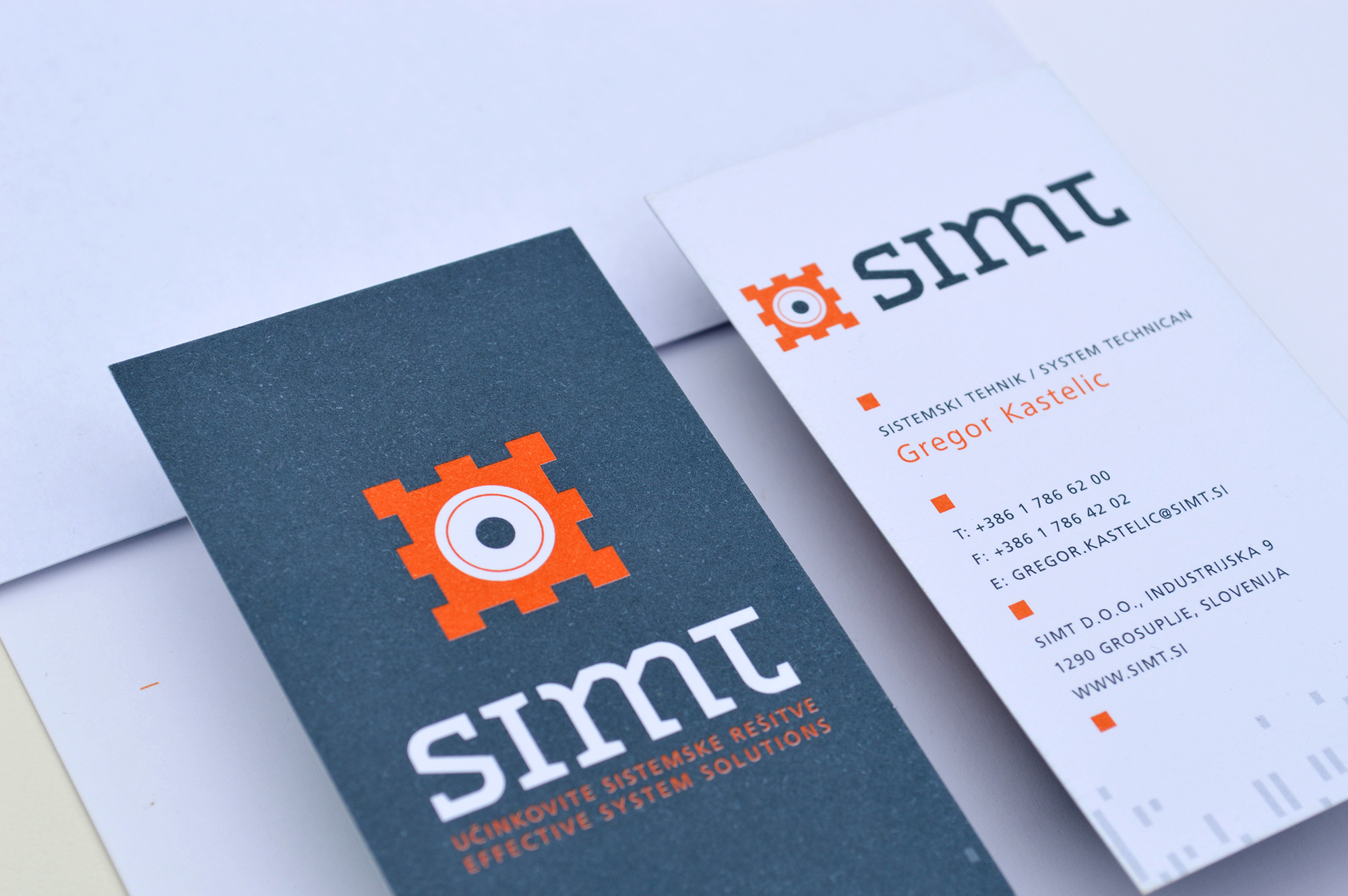
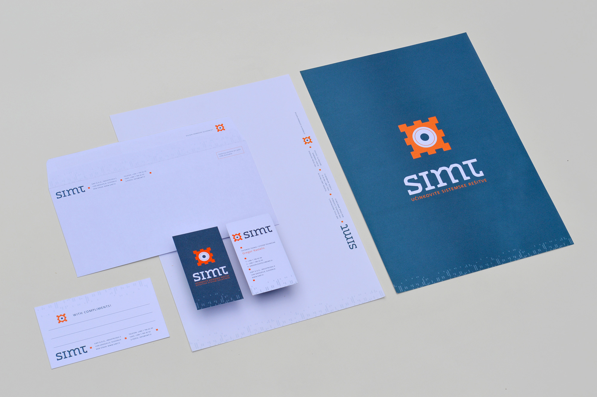
Simt Stationary
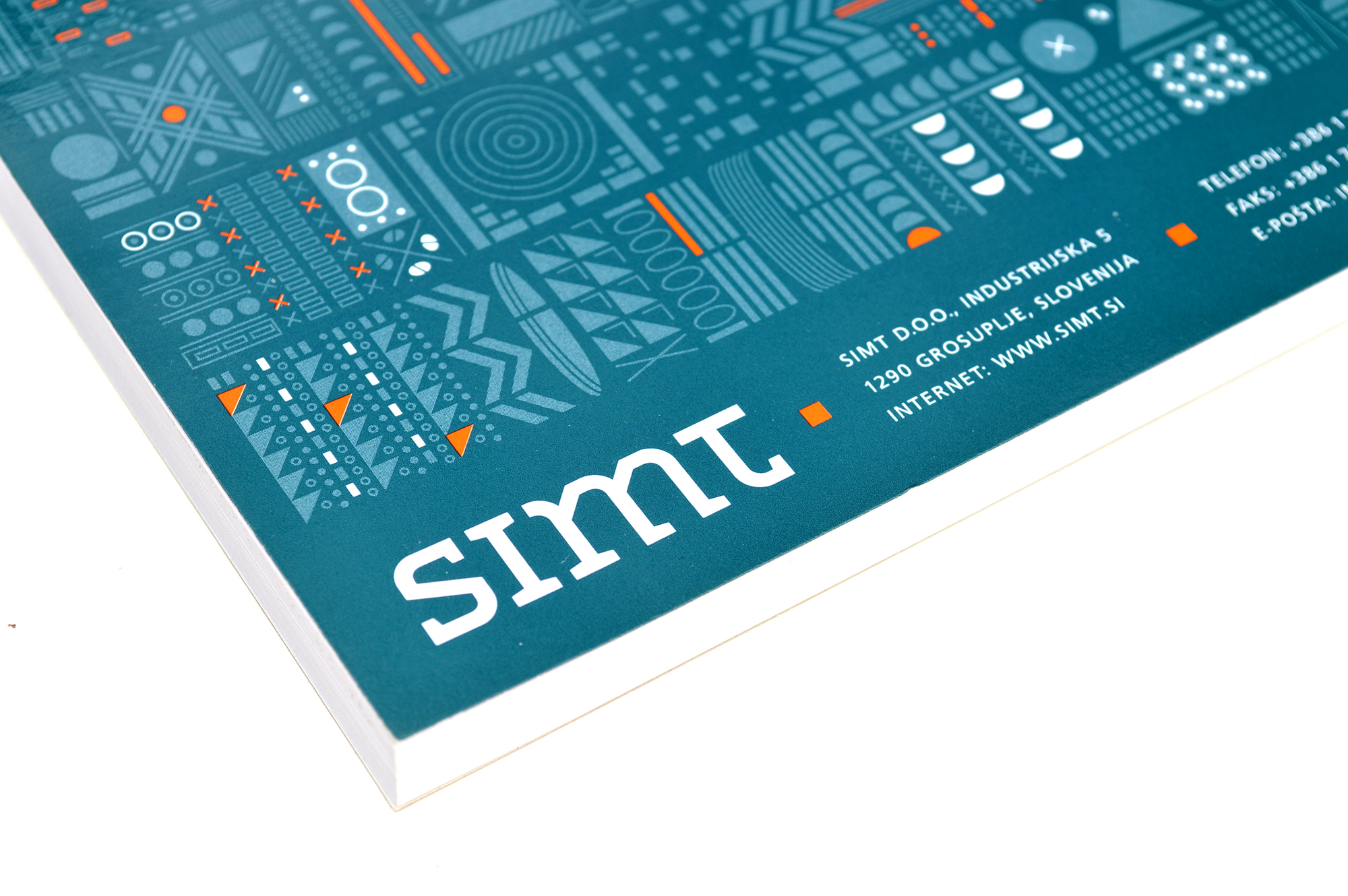
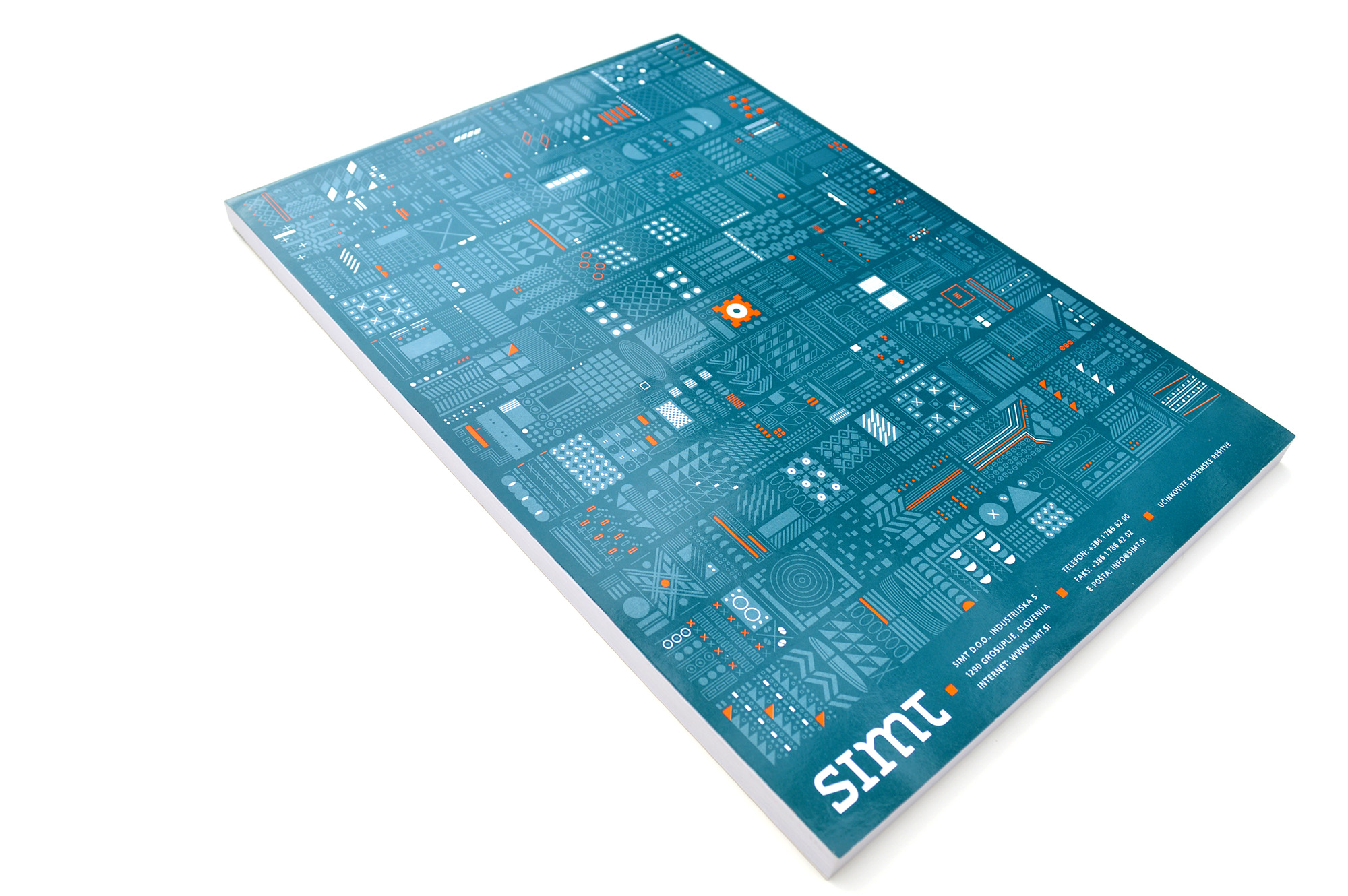
Simt Notebook
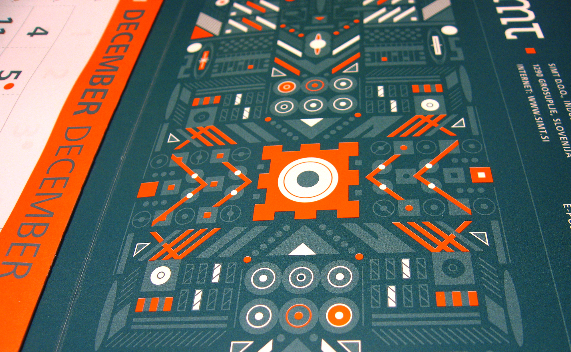
Simt 2007 Calendar


Simt Folding
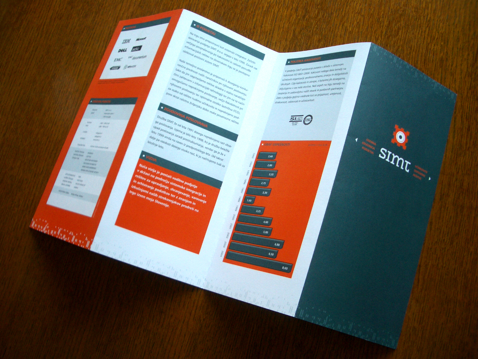
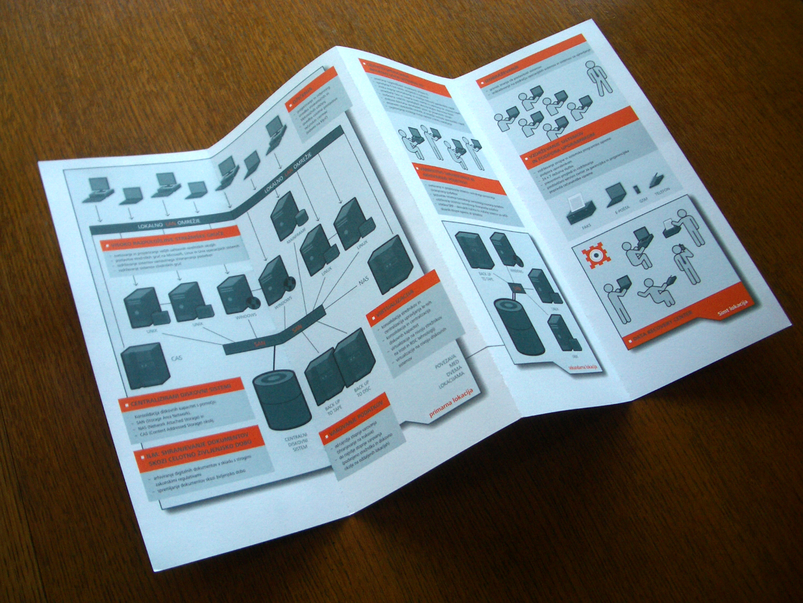
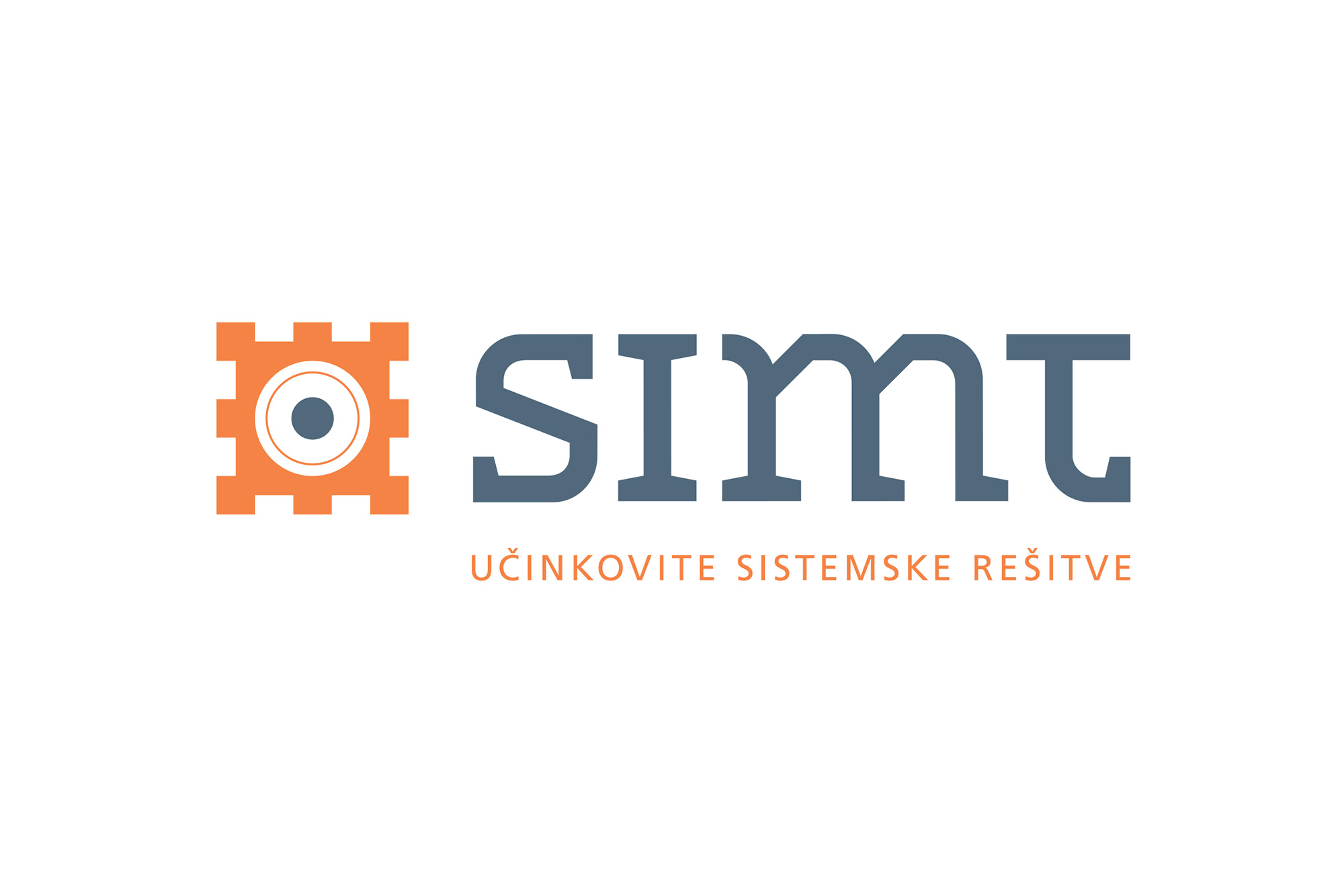
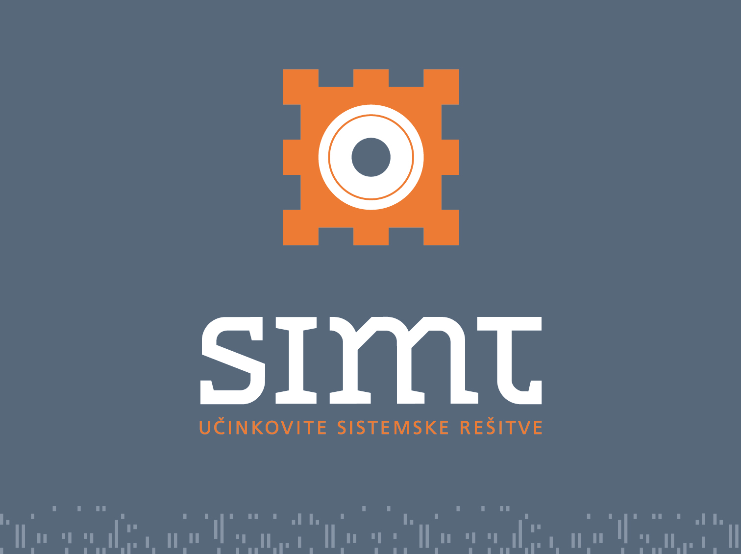
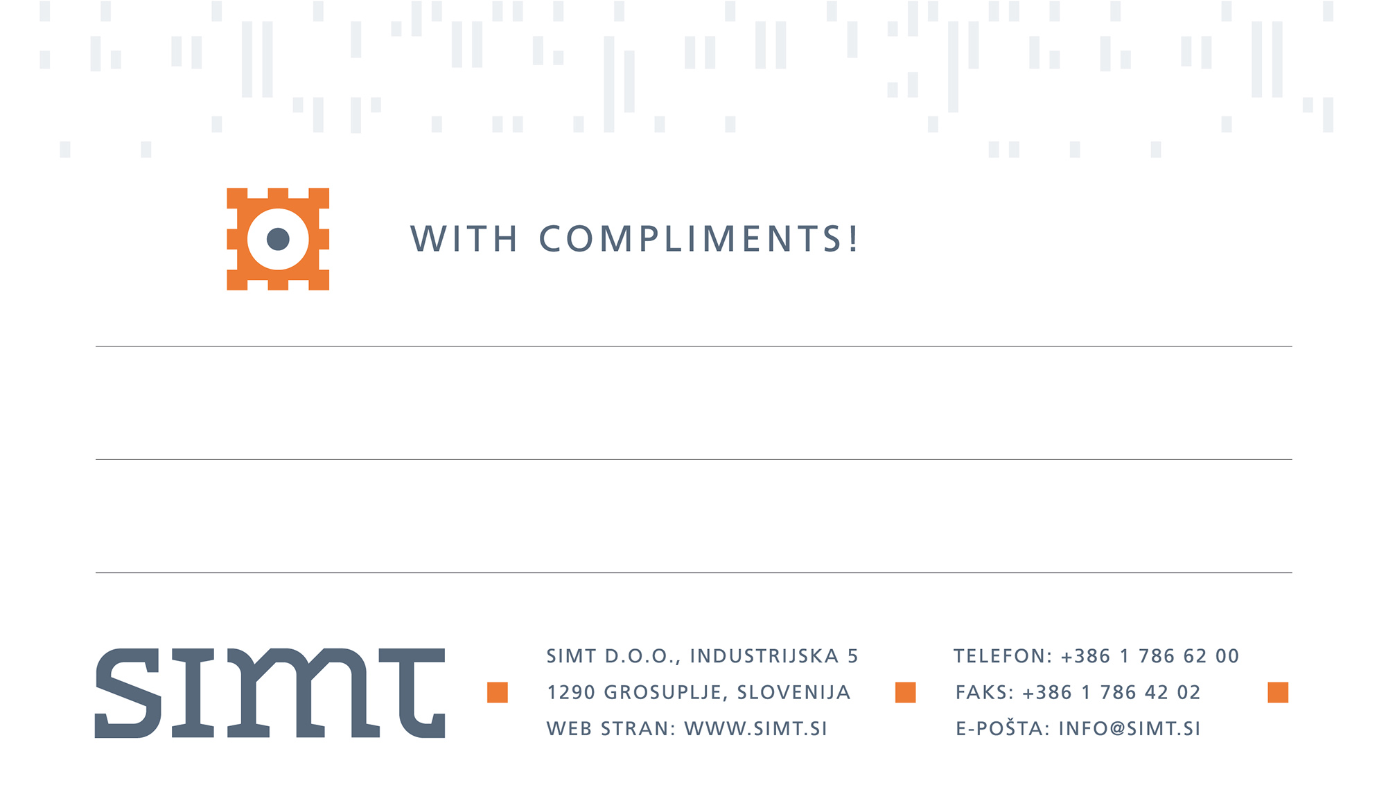
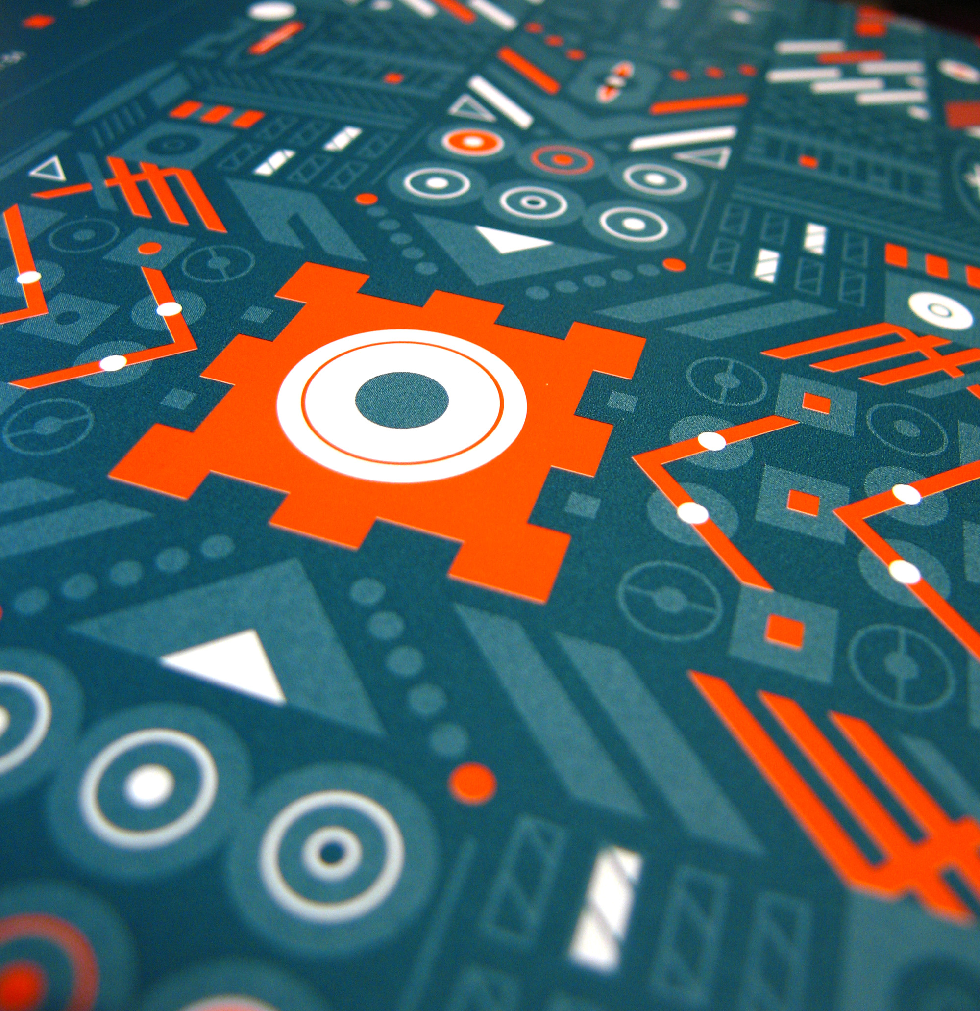
This project marks the first major visual identity campaign for studio Lukatarina, co-created with Katarina Mrvar. For Simt, an information systems provider, we designed a bespoke identity built upon custom, hand-drawn typography. The central symbol embedded within the logotype visualizes the "heart" of a computer system—a vital microchip that directs, connects, and powers everything. The system's functional elements, such as the square bullet points, are derived directly from the anatomy of this core symbol.
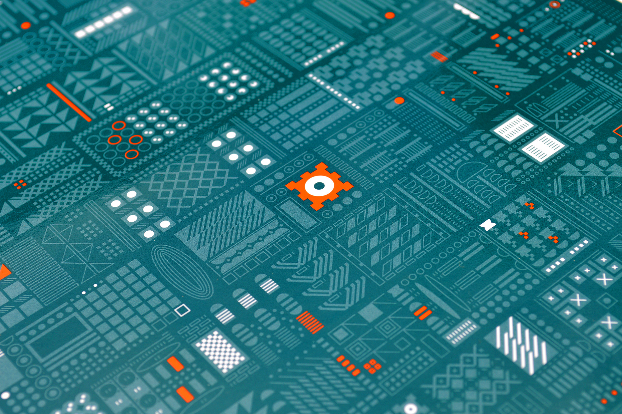
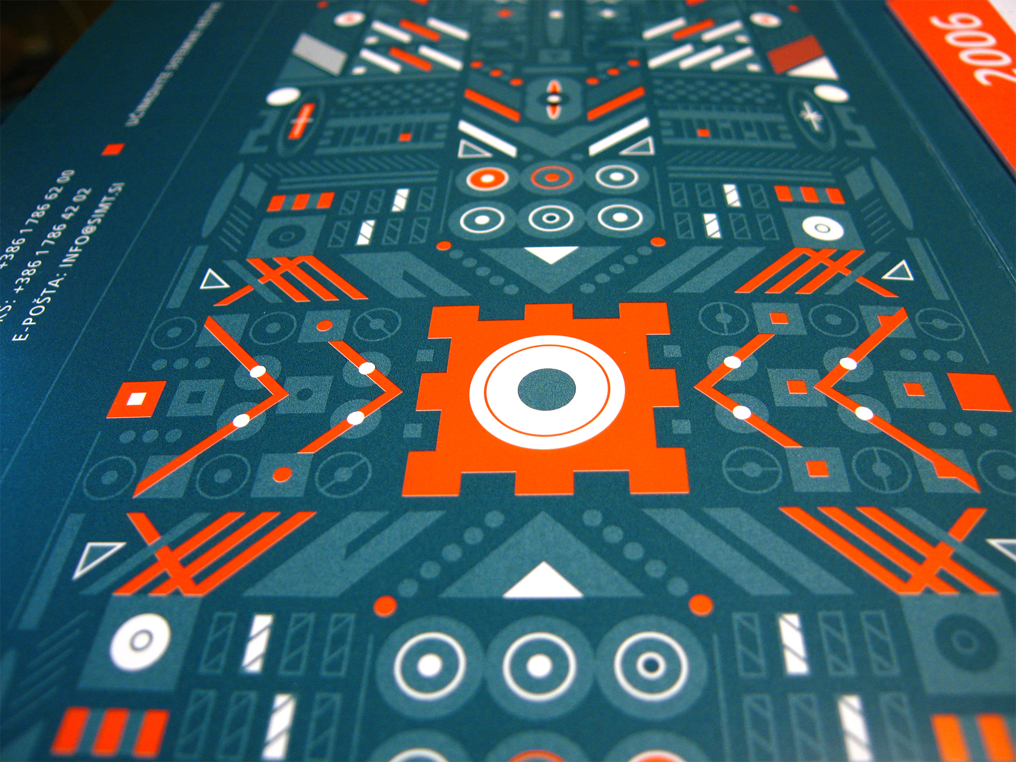
A defining feature of the brand identity lies in its secondary visual elements. These abstract graphics symbolize computer hardware, technical complexity, and the digital essence of IT systems. The intricate grid patterns came to life across various applications, most notably commanding the cover of the corporate notebook and the brand's wall calendar, transforming technical precision into a compelling visual narrative.
A defining feature of the brand identity lies in its secondary visual elements. These abstract graphics symbolize computer hardware, technical complexity, and the digital essence of IT systems. The intricate grid patterns came to life across various applications, most notably commanding the cover of the corporate notebook and the brand's wall calendar, transforming technical precision into a compelling visual narrative.