
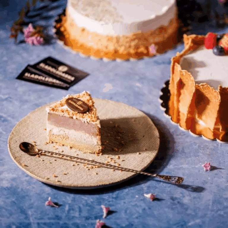


This project encompasses the comprehensive visual identity design for Sladoledarna. As the successor to a popular ice cream parlor at the Koper market, it evolved into a true artisanal ice cream "factory." This family-run business has always driven its craft with pure passion, and the birth of the new brand marks a significant leap toward originality, authenticity, and uncompromising quality. By using premium ingredients and inventive flavor profiles, Sladoledarna has firmly established itself as one of the most celebrated ice cream destinations—becoming an almost mandatory stop for holidaymakers heading back from the coast past Koper, looking for a sweet detour.
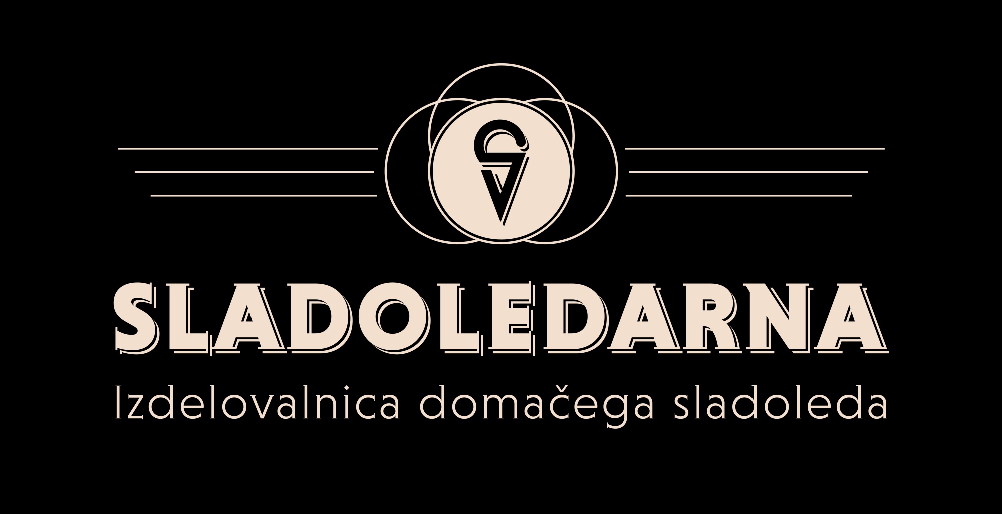
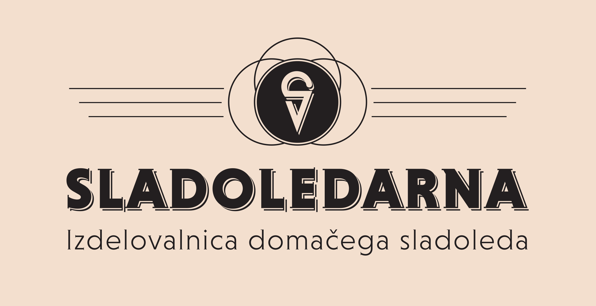
The visual concept of the logo is anchored in an iconic emblem that seamlessly and organically fuses the initial letter S with the silhouette of an ice cream scoop. Stylistically, the identity draws inspiration from Art Deco—arguably the most elegant, nostalgic, and artistically refined movement of the early 20th century. The choice of this historical style perfectly complements the ice cream craft; on one hand, it evokes a sense of rich tradition and heritage, while on the other, its geometric precision conveys a highly contemporary, sophisticated, and urban aesthetic.
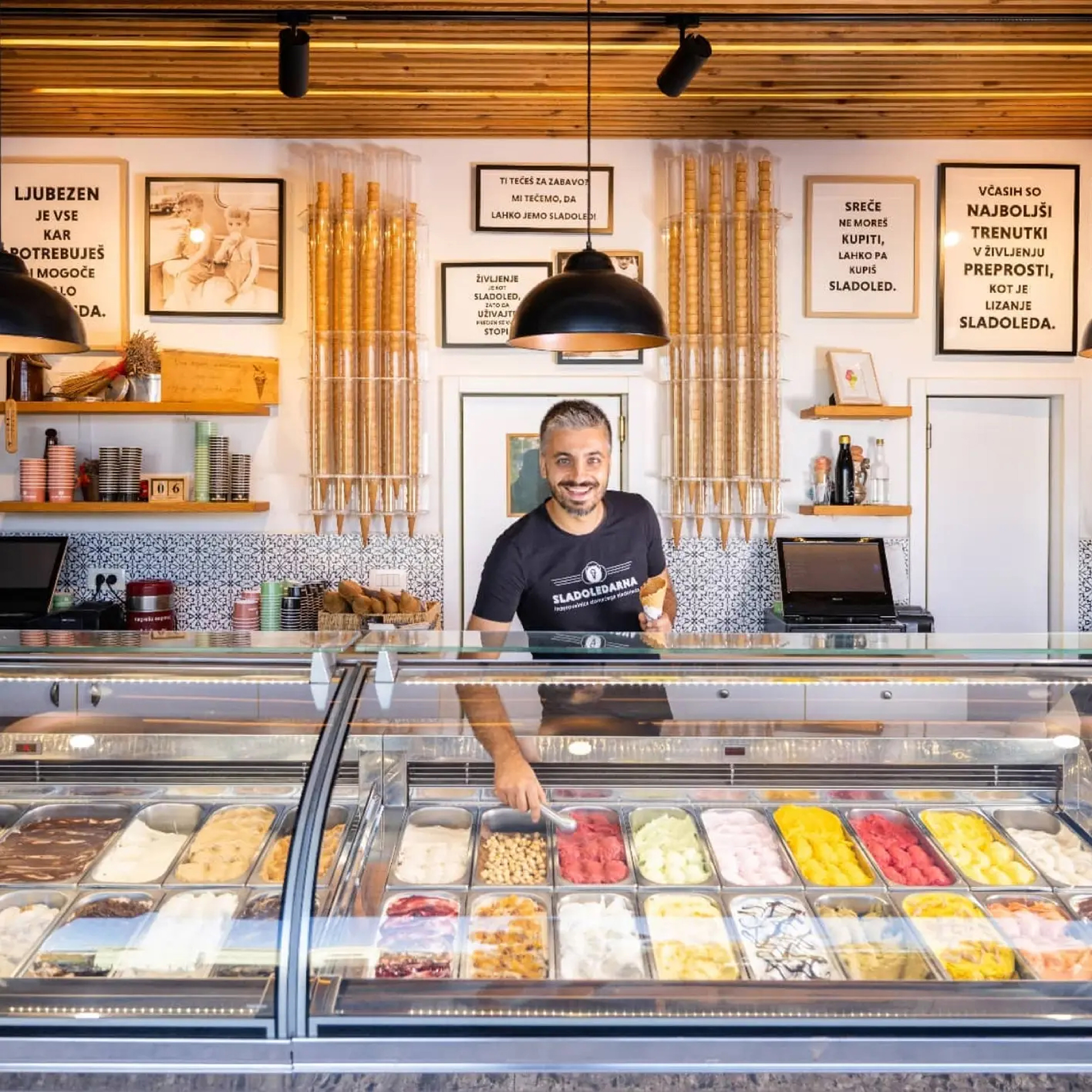
Important part of the identity is a carefully selected Art Deco-inspired font, Niveau Serif. Beyond defining the core logotype, it commands the brand's entire narrative layout—from headings and statements on the website to framed quotes and thoughts decorating the interior walls of the shop.
The visual concept of the logo is anchored in an iconic emblem that seamlessly and organically fuses the initial letter S with the silhouette of an ice cream scoop. Stylistically, the identity draws inspiration from Art Deco—arguably the most elegant, nostalgic, and artistically refined movement of the early 20th century. The choice of this historical style perfectly complements the ice cream craft; on one hand, it evokes a sense of rich tradition and heritage, while on the other, its geometric precision conveys a highly contemporary, sophisticated, and urban aesthetic.
Important part of the identity is a carefully selected Art Deco-inspired font, Niveau Serif. Beyond defining the core logotype, it commands the brand's entire narrative layout—from headings and statements on the website to framed quotes and thoughts decorating the interior walls of the shop.