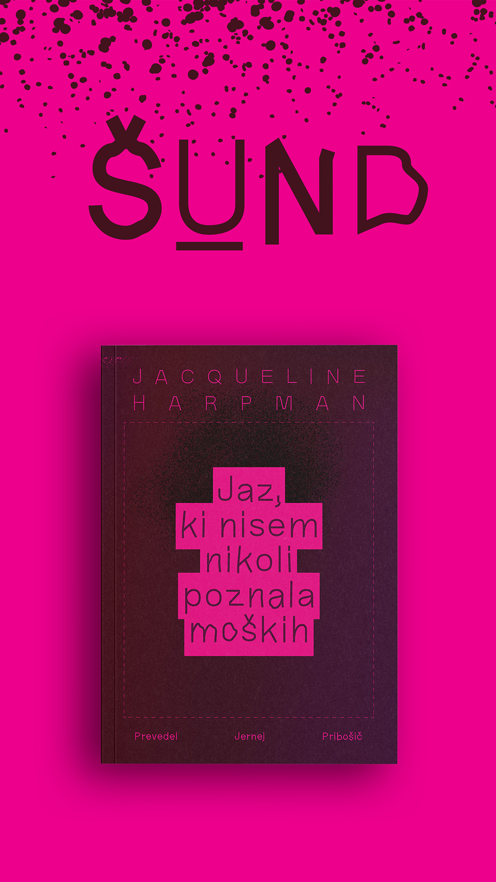






The name of the Šund book series deliberately reclaims a historically stigmatized term to challenge deep-rooted assumptions about who dictates literary value. Traditionally used to dismiss mass-market, highly accessible literature—particularly works centering on women and their lived experiences—the term "pulp" historically carved out vital spaces for new social dialogues and marginalized communities.
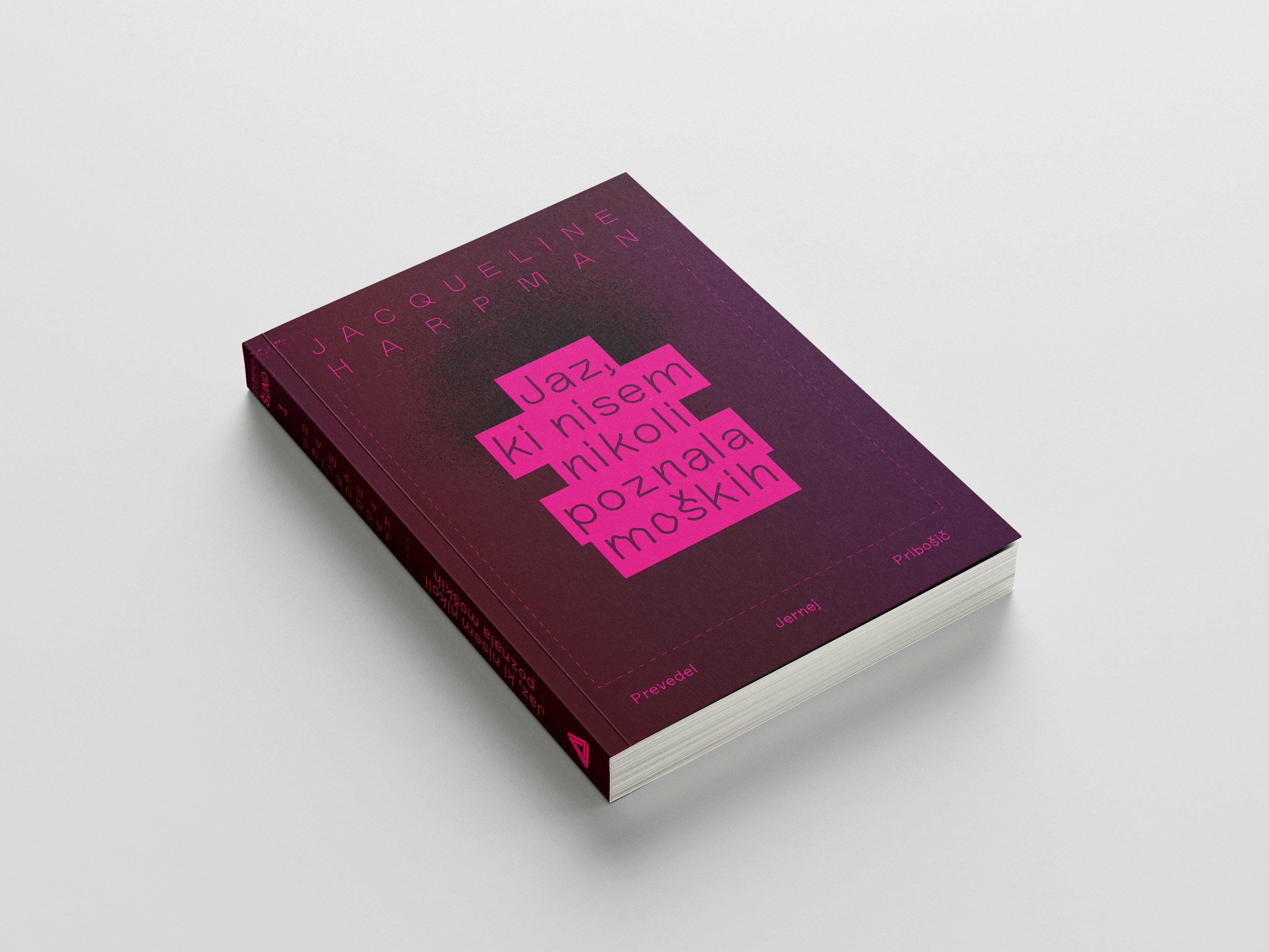
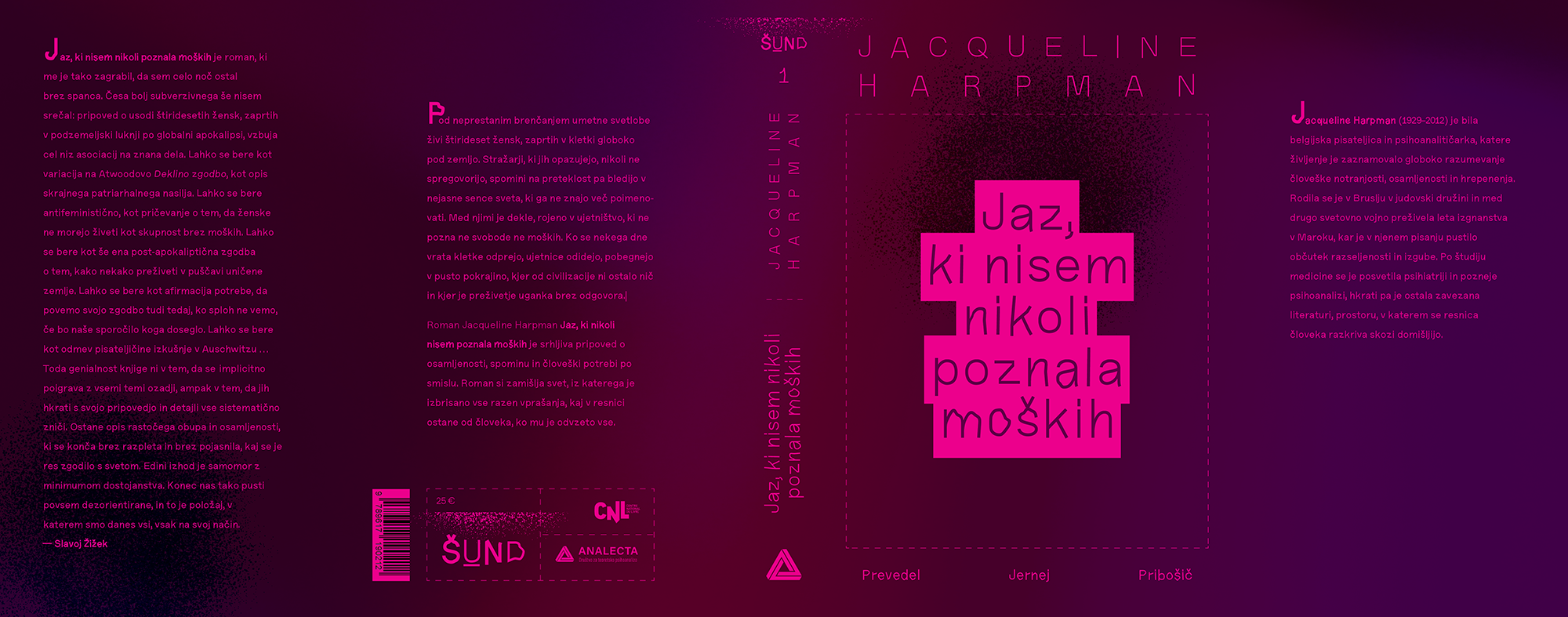
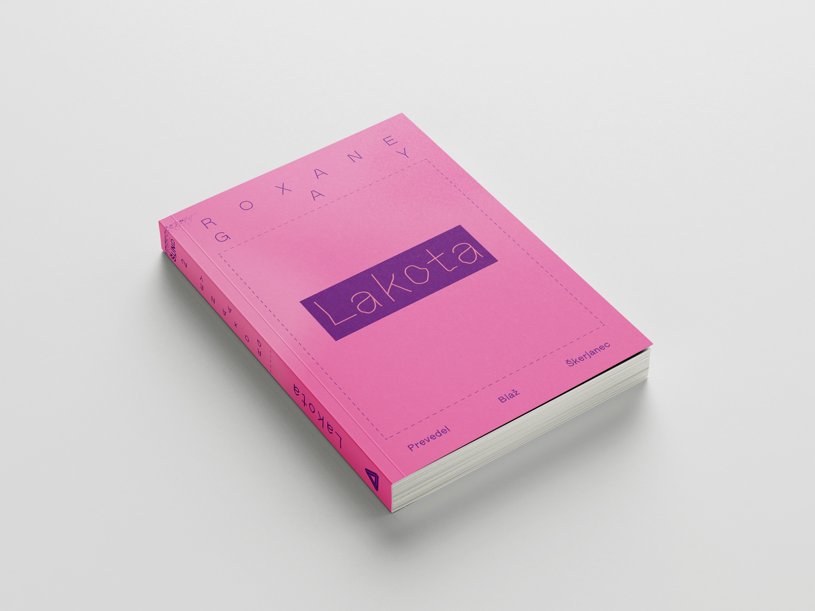
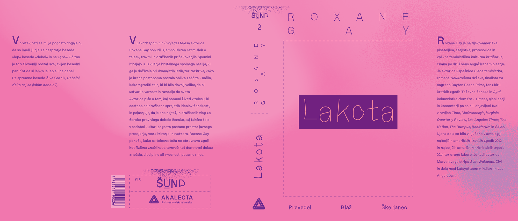
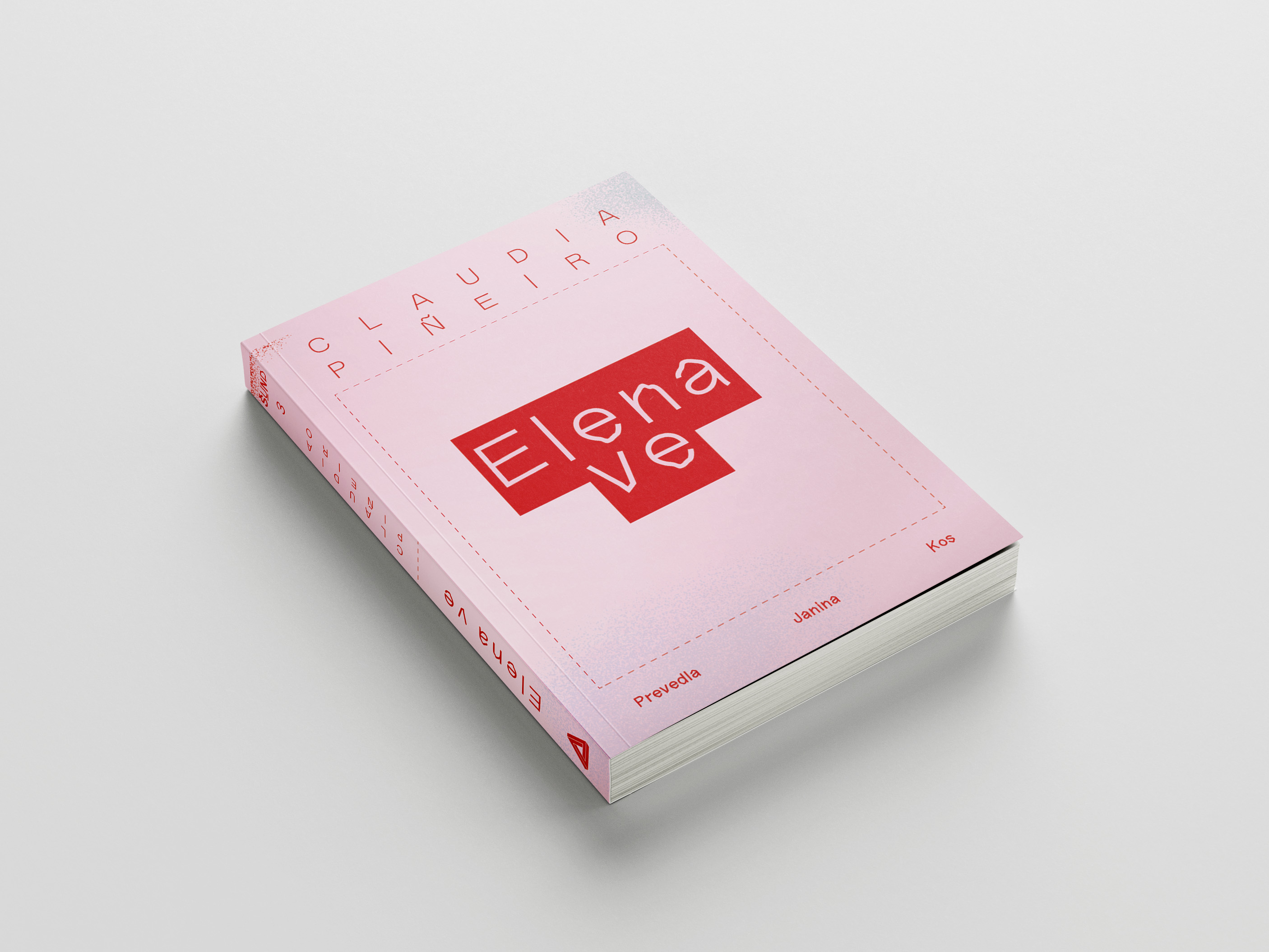
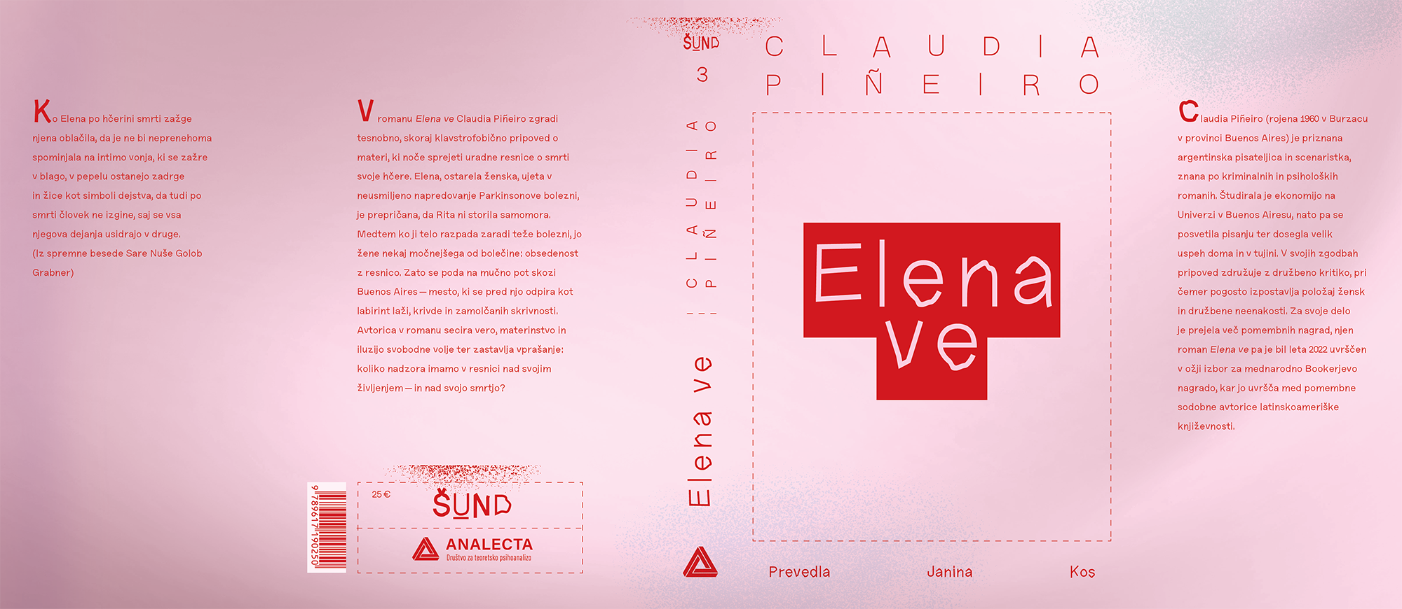
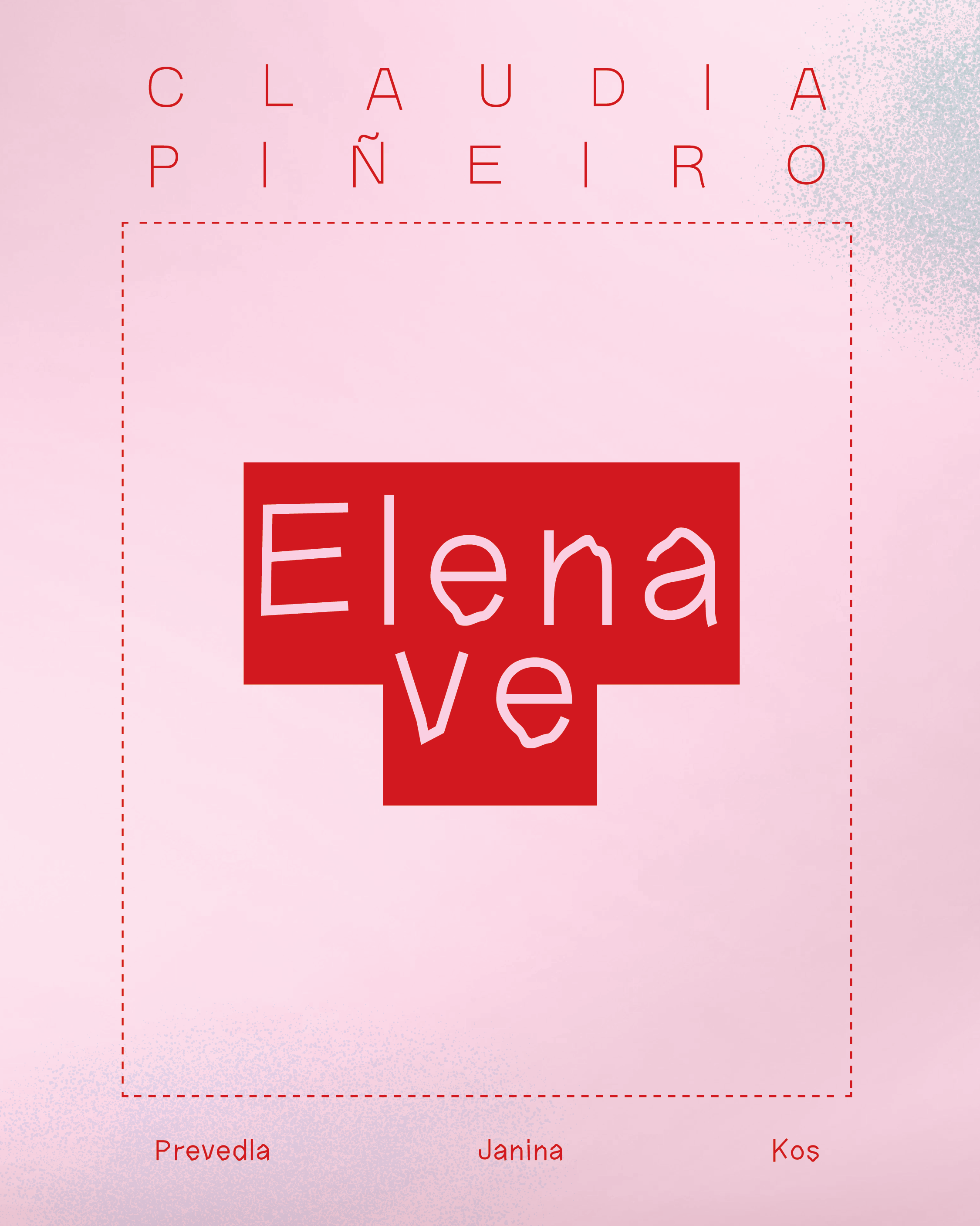
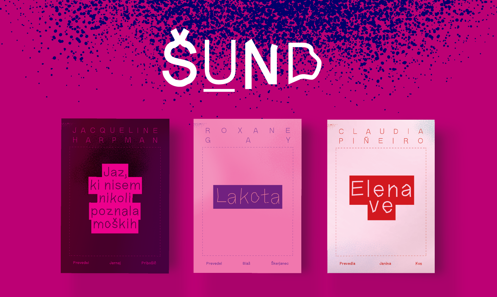
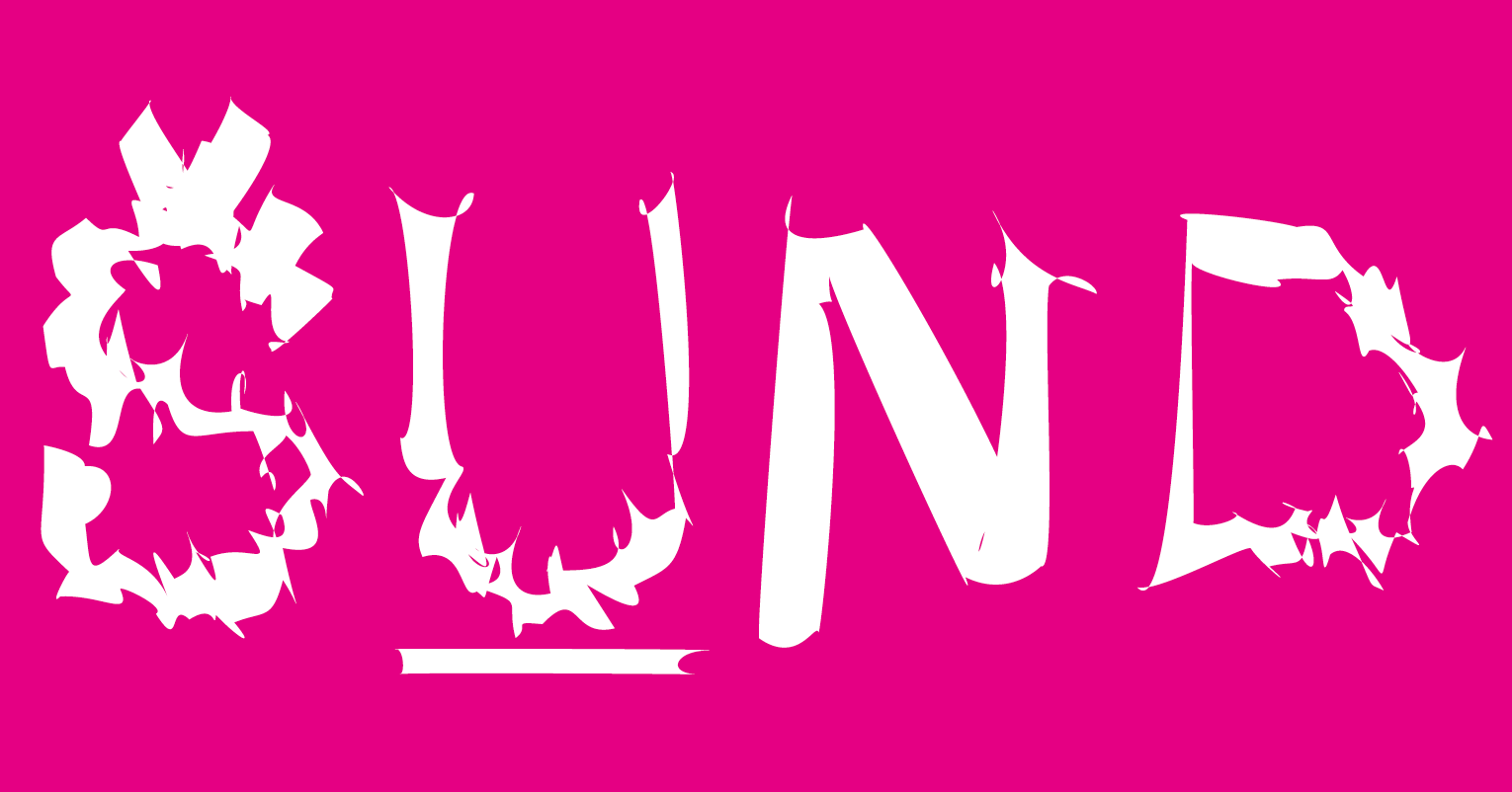
The visual identity of the collection directly mirrors this inherent defiance. The typography centers on a distorted typeface, its raw imperfection embodying the feminist themes and narratives of women on the fringes of society. This grit is intentionally juxtaposed with traditional design elements: a classic frame and centered alignment serve as a nod to canonical book-binding heritage. Produced in a vibrant spectrum of pink hues, the entire series subtly yet boldly subverts conventional expectations surrounding the aesthetics of "women's literature."
The visual identity of the collection directly mirrors this inherent defiance. The typography centers on a distorted typeface, its raw imperfection embodying the feminist themes and narratives of women on the fringes of society. This grit is intentionally juxtaposed with traditional design elements: a classic frame and centered alignment serve as a nod to canonical book-binding heritage. Produced in a vibrant spectrum of pink hues, the entire series subtly yet boldly subverts conventional expectations surrounding the aesthetics of "women's literature."